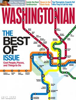
I was in the grocery store last night and while waiting in the checkout aisle I could not help but notice this month’s Washingtonian. Washingtonian is a monthly print magazine popular in the DC metropolitan area which includes Northern Virginia and Suburban Maryland. It tends to caters to the DC area’s more affluent residents with stories about food & dining; homes; travel; health and homes. What caught my attention about this particular edition of the Washingtonian was the cover image design. It features a map resembling the Washington Metro system, but instead of charting station names it instead lists out popular places, people and things to do in the nation’s capital.

What struck me about the cover design were two things:
- First, the Positive – I love the concept of using a map, chart or other well recognized visual, but with different content overlaid. For example, 3M uses the Periodic Table of Elements that we all remember from high school chemistry in its annual report to explain its various lines of business. The Washington Metro map (which could be easily replaced with the London Underground map or NY City Subway map) is compelling because it takes a familiar schematic that people already know to represent information.
- Second, the Negative – Of all the months to use this cover illustration, why introduce this now just a few weeks after the fatal crash of two Metro trains in suburban Maryland last month? Nine people were killed and 76 were injured June 22nd in the worst metro transit accident in recent history. When most people think about the DC Metro these days their thoughts immediately wander to the recent crash. So although I love Washingtonian’s cover design I think the timing of its release was a poor choice.


