
25 Marketecture Diagram Examples
From SaaS, cloud, and tech companies
Marketecture diagrams organize all of a company’s products onto a single page to highlight the breadth and depth of their capabilities. Typically, products are grouped into layers to demonstrate how the capabilities inter-relate and to illustrate the increasing levels of value.
The term “marketecture” is a portmanteau or combination of the words “marketing” and “architecture.” The diagrams are organized and presented much like a technical architecture diagram, but the goal is not to provide a detailed, blueprint of how the products are built. Instead, the goal is to market the portfolio by making it simpler for customers to understand the breadth of capabilities provided.
Marketecture diagrams are typically designed by product marketing teams usually with the assistance of a gifted creative director or agency.

Below is a compilation of 25 marketecture diagram examples from some of the largest and most successful technology companies. We have included a mix of examples from different types of technology companies including business applications (SaaS), cloud infrastructure, cybersecurity, AI/ML, data, and analytics. The companies are listed below:
1) Adobe Creative Cloud
Adobe provides marketing software that is widely used by everyone from amateur photographers and small creative agencies to large enterprises and advertising conglomerates. The company divides its offerings into two primary product lines and has a marketecture diagram for each.
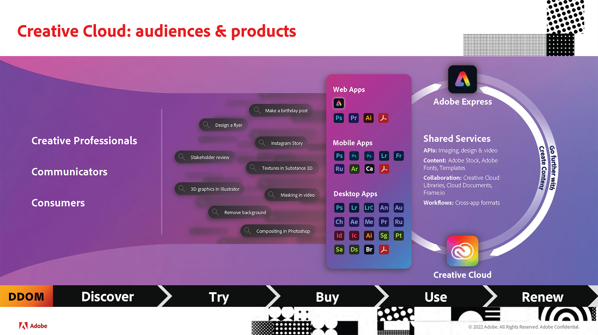
As you might expect from a creative company, Adobe doesn’t follow the rules when it comes to marketecture diagrams. Adobe uses bright, vibrant colors. There are no product names on the chart. Instead of a traditional vertical stack, the diagram builds from right to left.
On the far right are the foundational elements of the cloud – the shared services (APIs, content, workflows). Moving to the left, we get to the a vertical column with Adobe’s product suite. The applications are grouped by deployment model (desktop, mobile, and web apps). Instead of product names, the company uses its distinctive periodic table style to reference apps (Ps = Photoshop, Ai = Adobe Illustrator). On the far left are the user community (creatives, communicators, consumers) as well as example use cases (Instagram story, design a flyer).
- Layout – Non-traditional, right-to-left
- Power phrases – Go further with, create content
- Colors – Purple with bold accents
- Iconography – None
- Products and platform features
- Use cases
- End customers
2) Adobe Experience Cloud
By contrast, the Adobe Experience Cloud looks more like a traditional vertical marketecture stack diagram. The Experience Cloud is a powerful suite of applications sold to mid-sized businesses, large enterprises, and marketing agencies.
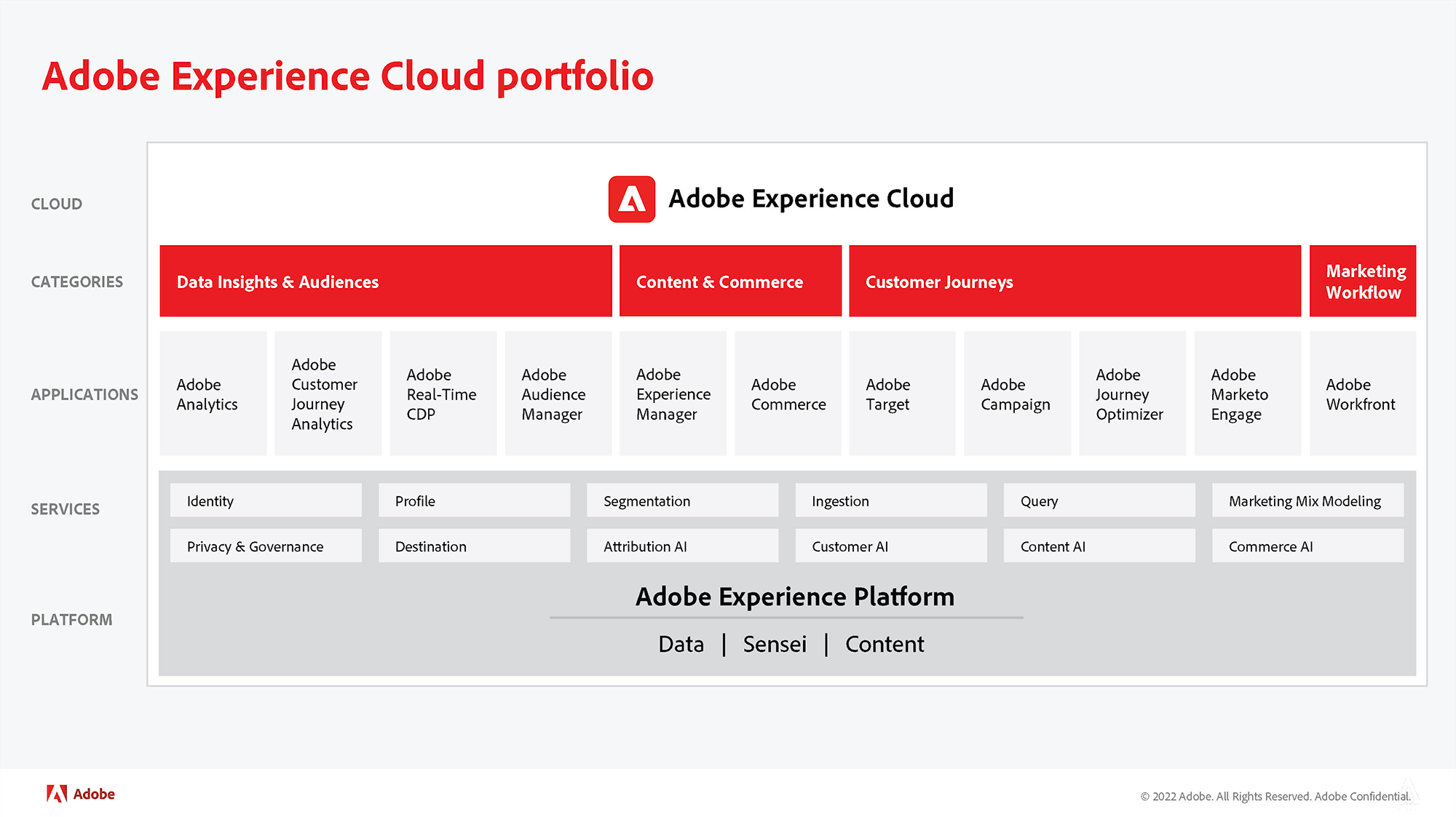
The stack builds from bottom to top with the foundational “platform” and “services” (identity, segmentation, attribution) enabling the applications above. At the top, the 11 different applications are grouped into four categories highlighted by the four red blocks. Descriptive/functional names (data insights and audiences and content and commerce) are used for the category names with the Adobe branded products listed below in the application layer.
- Layout – Vertical stack
- Power phrases – None
- Layer names – None
- Colors – Red used to highlight categories
- Iconography – None
- Products and platform features
3) Alteryx
Alteryx describes itself as “analytics automation platform.” Alteryx makes it easy (low code/no code) for business and IT professionals to 1) collect data from a variety of different sources, 2) analyze the data using poweful AI/ML technology, and 3) share the insights with a variety of audiences.
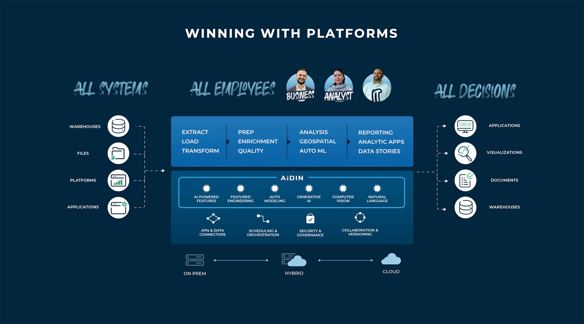
Alteryx marketecture diagram shows information flows left-to-right starting with the source systems (data warehouses, file systems, business applications) – think Snowflake, AWS Redshift, Databricks, and Google BigQuery. Data flows into the Alteryx platform in the center, which is a typical vertical marketecture stack. Deployment options are at the bottom (on-prem, hybrid, cloud). The stack builds bottom-to-top with the most differentiated capabilities at the top (extract, load, and transform; analysis, geospatial, auto ml). To highlight the value proposition, the user community is depicted with the key end-user personas at the top with photos of real people. After crossing the Alteryx stack, the left-to-right information flow continues on the far right with the various output options such as visualizations and documents.
- Layout – Vertical stack
- Power phrases – All systems, all employees, all decisions
- Value statement – Winning with platforms
- Layer names – AiDIN for top layer of stack
- Colors – Slight variations differentiate layers
- Iconography – Three styles
- Products and platform features
- User community
- Information flows
4) Appfolio
Appfolio offers business applications for the real estate industry. The customers are typically property managers who own (or act on behalf of owners) single-family homes, multi-family apartments, student housing, senior housing, and other rental properties.
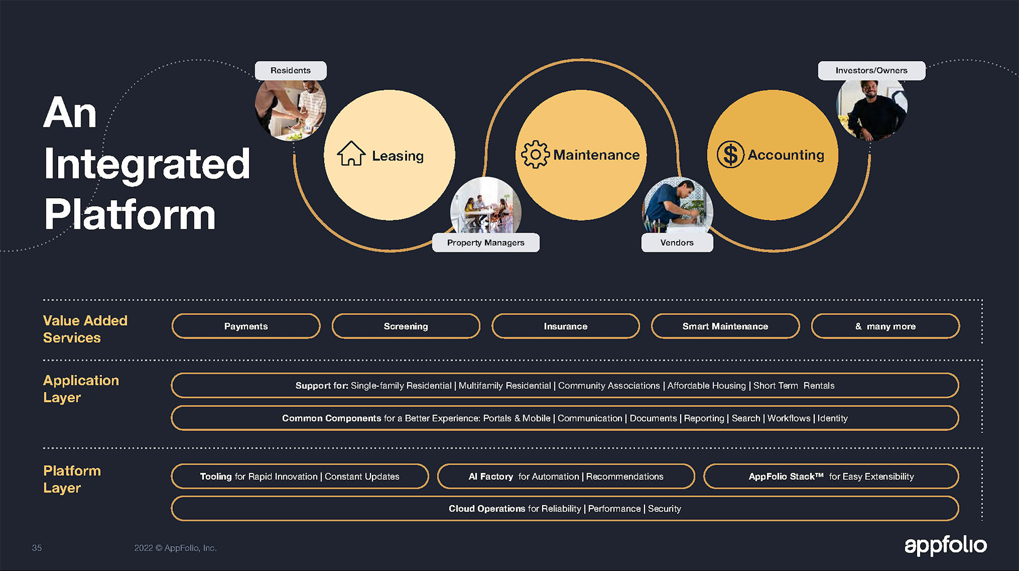
Appfolio’s marketecture diagram combines a traditional vertical stack (at the bottom) with the ecosystem diagram of its stakeholder community (at the top). Starting at the bottom are the platform features and a key benefit statement for each (e.g. AI Factory for Automation | Recommendations). The application layers list another set of common components as well as the various types of properties supported (affordable housing, short-term rentals). At the top of the stack are the value-added services (online payments, background screening, landlord insurance, property maintenance) positioned just below the illustration of the various stakeholders (residents, property managers, vendors, investor/owners).
- Layout – Vertical stack
- Power phrases – none
- Layer names – Functional/descriptive
- Colors – Same for all layers
- Iconography – none
- Products and platform features
- Value chain
5) C3.ai
C3.ai provides enterprises with a development environment to build artificial intelligence applications rapidly – instead of having to write all the complex, programming code themselves. The company also offers a suite of turnkey AI-based applications for specific industries such as oil and gas, automotive and manufacturing, aerospace and defense.
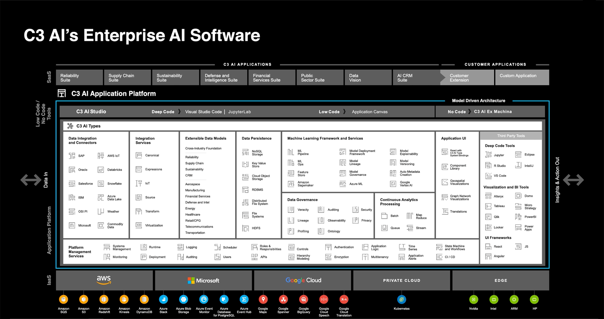
C3.AI’s marketecture diagram is nothing short of awe-inspiring to both engineers and product marketers alike. It’s a typical vertical marketecture stack but with a much more ambitious level of detail than what is found in most diagrams. Starting at the bottom are the environments that C3.AI’s applications can be deployed to (AWS, Azure, GCP). The next layer up (in white) is the core platform management services which support eight groups of features organized into vertical columns (data integration, machine learning framework). At the top of the marketecture diagram are the industry-specific applications (supply chain suite, defense and intelligence suite) in gray. Although not prominent, the information flows are represented as well with “data in” on the left and “insights and actions out” on the right.
- Layout – Vertical stack
- Power phrases – none
- Layer names – Functional/descriptive
- Products and platform features
- Application ecosystem
- Information flows
6) Cloudflare
Cloudflare offers two primary groups of products. The first ensures that Internet/external-facing applications such as websites, apps, APIs are safe from attack, fast, and reliable. The second provides a similar set of capabilities (security, performance, and reliability) for internal corporate networks.
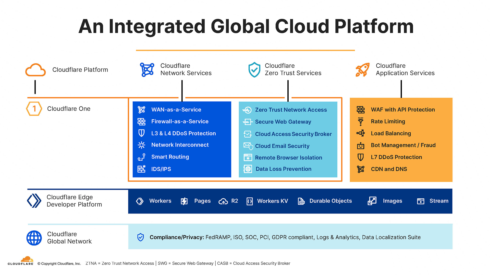
Cloudflare’s marketecture diagram follows a traditional vertical stack approach with a list of compliance and privacy certifications at the bottom that apply to all the services above. Each layer of the stack is branded “Cloudflare Edge Developer Platform,” “Cloudflare One,” etc. The centerpiece of the stack is the three colored boxes with the network, zero trust, and application services each with a list of six key features underneath. A few key design strategies that improve readability: 1) the names of the product groups are offset from the stack with surrounding negative space and 2) the application services (highest value layer) are not stacked on top but positioned to the right for readability.
- Layout – Vertical stack with a modification
- Power phrases – None
- Layer names – Branded
- Colors – To highlight important product groups
- Iconography – For each layer and product
- Products and platform features
7) Crowdstrike
Crowdstrike is one of the leading providers of cybersecurity for businesses and government agencies. The product portfolio includes all the key capabilities – EDR, XDR, identity threat protection, threat intelligence, ITSecOps, cloud security, and log management.
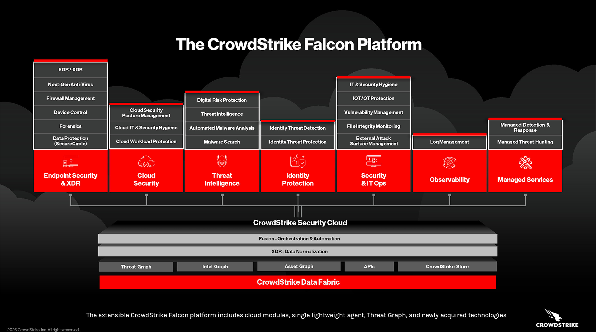
The marketecture diagram is a traditional vertical stack, but with a few differentiated design strategies that make it stand out from the crowd. At the bottom is the Data Fabric which includes the key intellectual property assets that provide differentiation to the platform (threat graph, intel graph, asset graph). The higher layers representing the Security Cloud consist of seven different product groups. Note how the designers avoided the typical symmetric approach for enumerating feature lists. Instead, there are two to six features listed for each group, which makes the diagram easier to read and also blends nicely with the abstract cloud images in the background.
- Layout – Vertical stack
- Power phrases – None
- Layer names – None
- Colors – To highlight key categories & differentiate layers.
- Iconography – For key product categories
- Products and platform features
8) Cvent
Cvent provides specialized business applications to help organizations run events – in-person, virtual, or hybrid. The company also operates a marketplace (hospitality cloud) that connects event organizers seeking conference space with hotel operators and other suppliers.
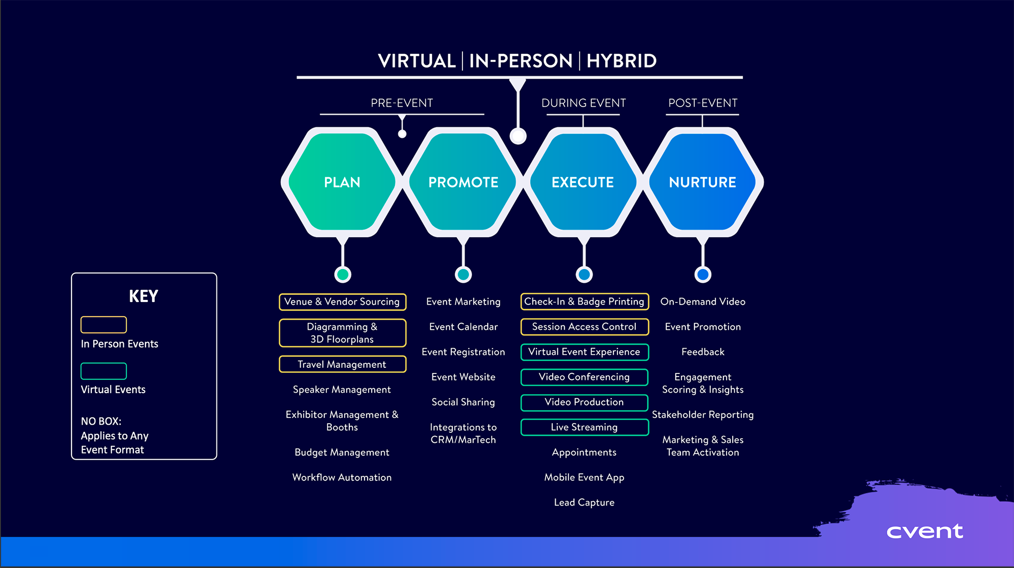
Cvent’s marketecture diagram is a little more complex than others requiring the audience to study it for a minute, but it does a great job of combining a number of concepts into a single illustration. Across the top is the event lifecycle (pre, during, post) and event categories (virtual, in-person, hybrid). Using a differentiated strategy, Cvent’s diagram is organized around the four “power verbs” (plan, promote, execute, nurture) rather than product categories. Under each of the four verbs is a list of product capabilities with colored boxes used to indicate which apply to each event category (virtual, in-person, or both).
- Layout – Non-traditional
- Power phrases – Plan, promote, execute, nurture
- Layer names – None
- Colors – For four power verbs
- Iconography – None
- Products and platform features
9) DataDog
DataDog helps businesses monitor the health, performance, and security of their IT infrastructure. The primary users are DevOps teams with either cloud or on-premise deployments.
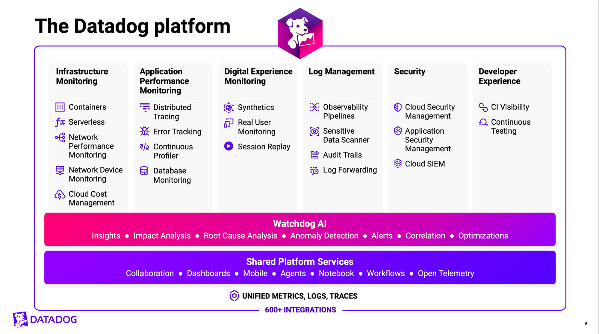
DataDog’s marketecture diagram follows the traditional vertical stack approach. The lower levels of the stack are accentuated with vibrant purple and pink colors to highlight the shared platform services and branded “Watchdog AI” capabilities. Across the top are six columns representing the key capabilities. Note, how the designers avoided the use of symmetry in the feature lists. Three to five features are provided in each column, which allows for more negative space and makes the diagram easier to read.
DataDog also has an ecosystem diagram, which not only illustrates its product capabilities, but how its platform interrelates with external applications and the user community.
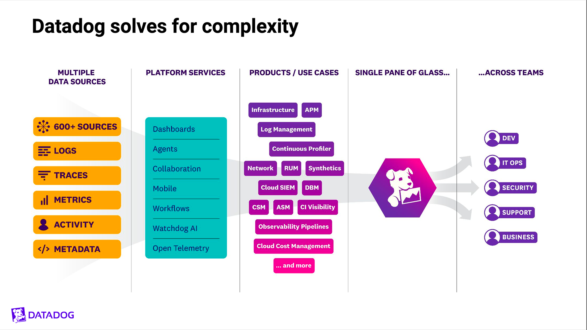
On the far left are the various inputs captured from the servers, applications, storage, and networking devices that are being observed and monitored. Next are the key capabilities labeled as “platform services” (analytics, visualizations, alerting). In the center is a mix of product names and use cases that are designed to be familiar to the DevOps user. The right side of the diagram communicates the value proposition – inputs from many different data sources correlated and displayed in a “single pane of glass” to multiple teams (dev, security, support).
- Layout – Vertical stack
- Power phrases – None
- Layer names – Functional/descriptive
- Colors – To highlight foundational layers
- Iconography – For the key product capabilities
- Products and platform features
- Application ecosystem
- Use cases
- User community
10) Dynatrace
Dynatrace helps IT organizations identify anomalies, issues, bottlenecks, and degradations across the range of cloud and on-premise environments they manage. It is designed to be an end-to-end, all-in-one platform for observing and securing IT assets.
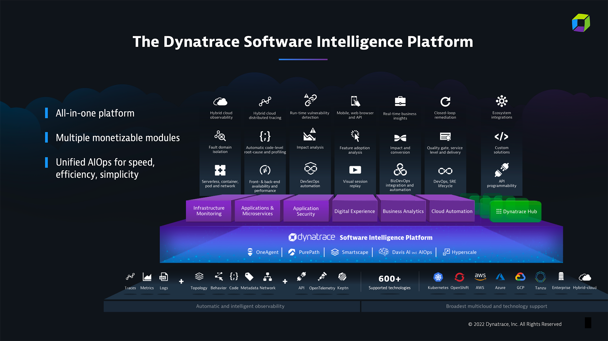
The Dynatrace marketecture diagram uses a traditional vertical stack approach, but with a powerful three-dimensional design that captures the audience’s attention. At the bottom are the various environments (Kubernetes, AWS, OpenShift) that inputs (traces, metrics, logs) are captured from and fed into the Dynatrace platform. The platform layer in blue highlights five branded core capabilities of the platform. The top of the stack is represented differently than most marketecture diagrams with products and features inverted. The six purple boxes reflect the key capabilities of Dynatrace (infrastructure monitoring, application security) with the three features of each listed above and offset at a further depth.
- Layout – Vertical stack
- Power phrases – All-in-one platform, etc.
- Layer names – None
- Colors – To highlight key layers
- Iconography. – Extensive throughout diagram
- Products and platform features
- Application ecosystem
11) Enfusion
Enfusion automates the key business processes in the investment lifecycle for securities trading. The company’s products are used by a variety of traders, portfolio managers, compliance and risk teams at hedge funds, asset managers, and family offices.
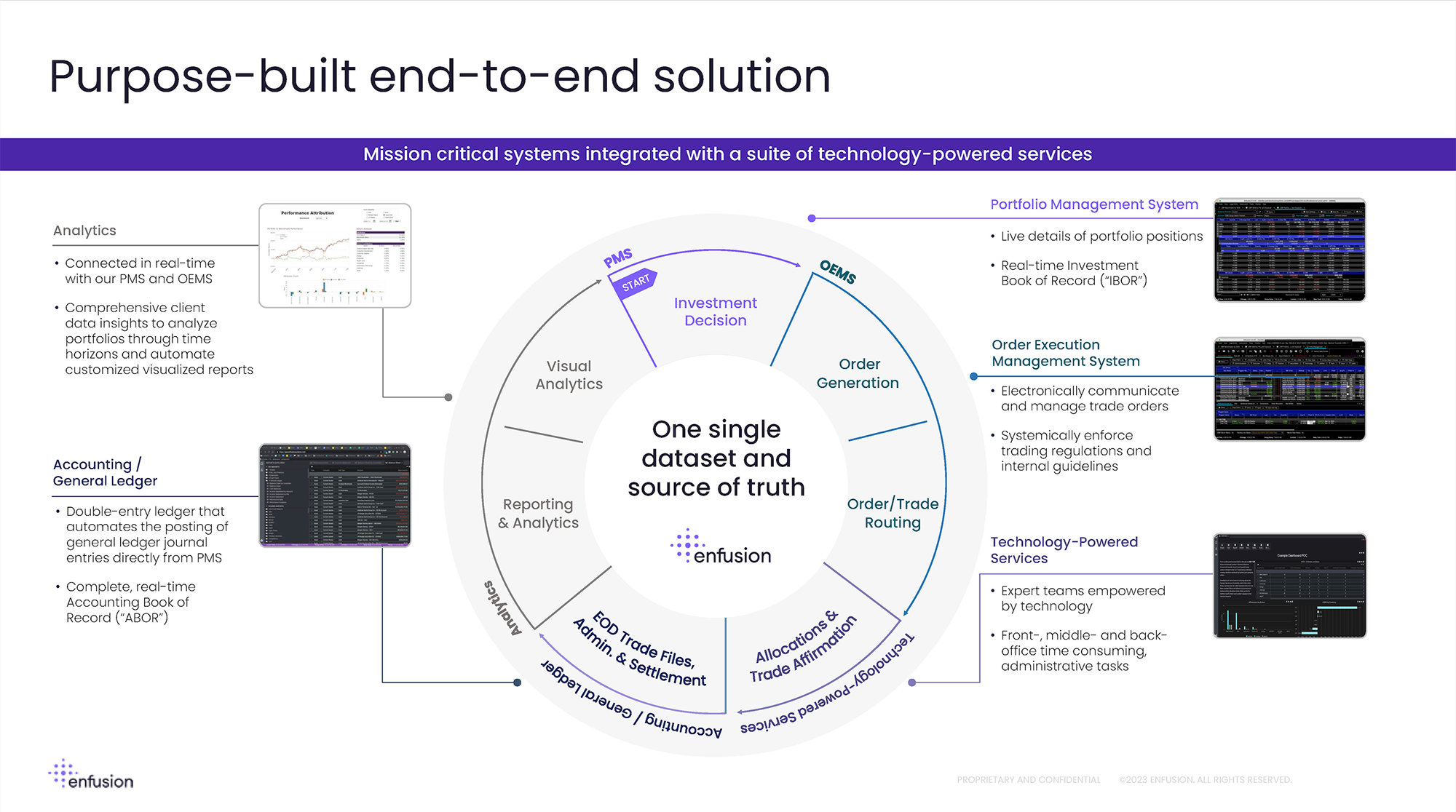
Enfusion’s marketecture diagram does a great job of illustrating the product capabilities, user experience, and investment lifecycle on a single slide. The trade lifecycle starts at the center top of the diagram with investment decisions and proceeds clockwise through order generation, trade routing, allocations, affirmation, clearing, and settlement. On the outer rim of the circle are five key capabilities (portfolio management, accounting/general ledger) with arrows linking to thumbnail versions of screenshots and a list of key features.
- Layout – Concentric circles
- Power phrases – One single dataset and source of truth
- Layer names – None
- Colors – Variations used for each segment of lifecycle
- Iconography – None
- Products and platform features
- Business process lifecycle (investment trading)
12) Fortinet
Fortinet provides cybersecurity and networking solutions to businesses of all sizes ranging from SMBs to enterprises, government agencies, and other security providers. The company has over 50 products ranging from LAN, WAN, and Network Operations Center (NOC) management to firewalls, intrusion prevention, and security incident response.
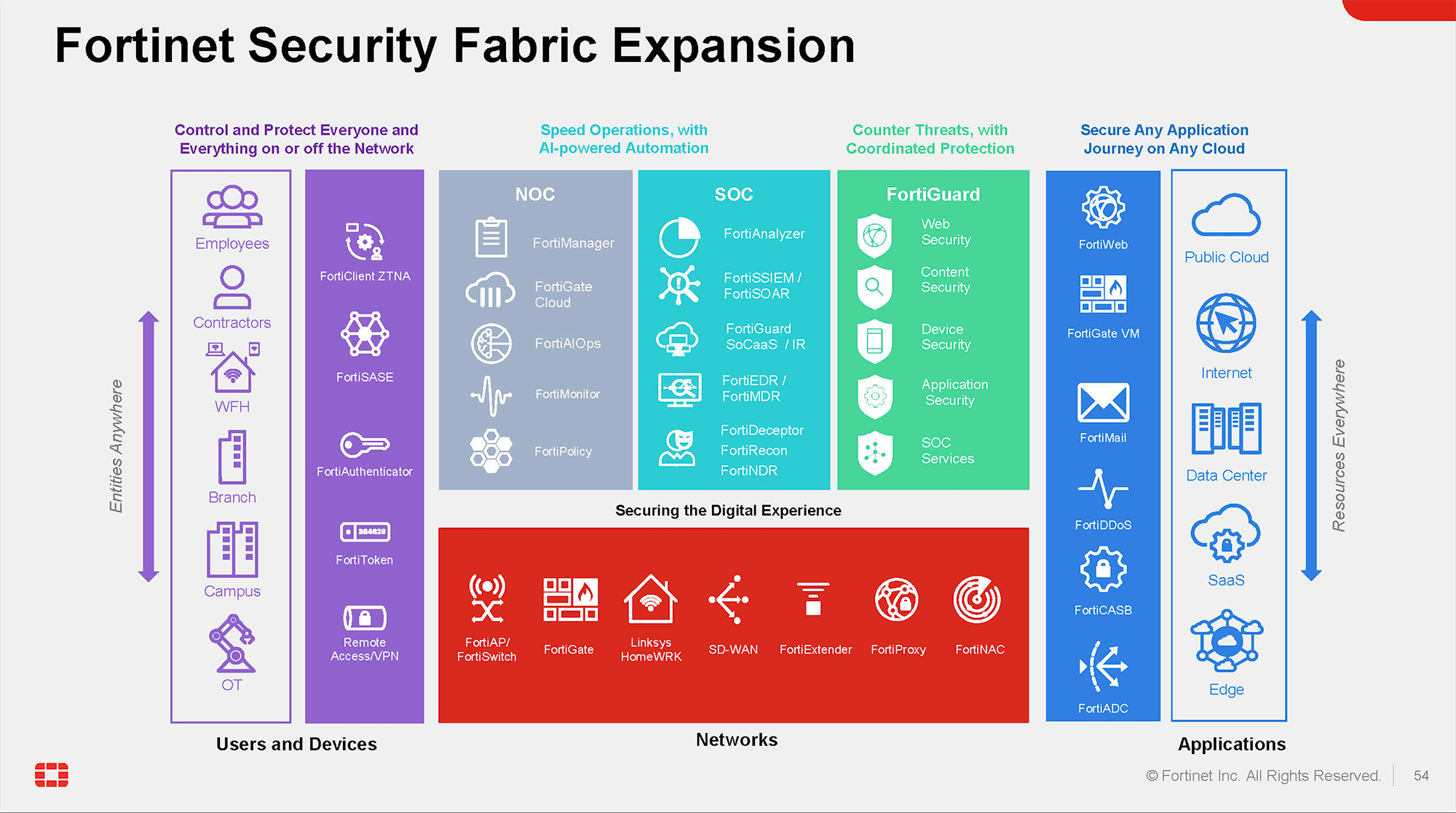
Fortinet’s marketecture diagram is a vertical stack, but it is organized into the context of how the products are used. VPNs, tokens, and authenticators are on the left next to the associated users and devices. Denial of service, cloud access security brokers, and app delivery controllers are on the right next to the associated environments they protect. Across the top are the products used by Network Operations Centers, Security Operations Centers, and the FortiGuard threat intelligence and research org.
- Layout – Vertical stack
- Power phrases – For each layer of stack
- Colors – Each layer differentiated with unique colors
- Iconography – Extensive throughout all layers
- Products and platform features
- Application ecosystem
- End-customer
13) JFrog
JFrog sells to the DevOps community with a focus on the deployment and release management processes for software. Their mission is to provide the software supply chain with the ability to continuously and securely deliver software updates across any system.
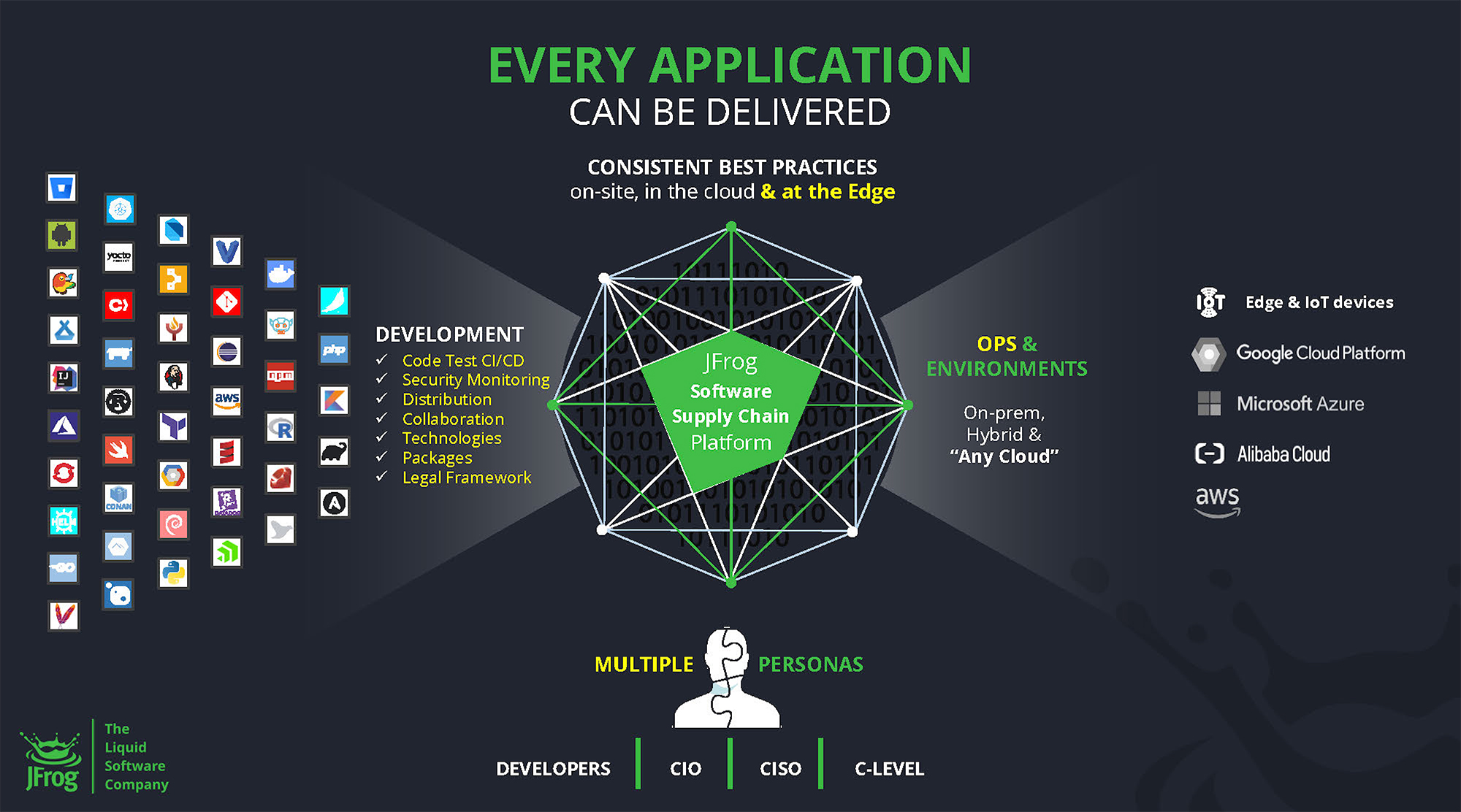
The centerpoint of JFrog’s diagram is the software supply chain platform which connects hundreds of development platforms on the left (illustrated by favicons) to the major cloud computing ecosystems on the right (Microsoft Azure, Google Cloud Platform, Amazon Web Services, etc.). At the bottom are the key buyer personas that use JFrog (developers) or benefit from the value proposition including (CIO/CISO).
- Layout – N/A
- Power phrases – Atop diagram “consistent best…”
- Colors – N/A
- Iconography – N/A
- Platform
- Application ecosystem
- User community
14) Lightspeed Commerce
Lightspeed provides point-of-sale, e-commerce, and payment applications for restaurants and golf course operators. They primarily sell to small businesses such as Five Guys and KemperSports who need technology to service customers at their physical locations as well as online and in mobile channels.
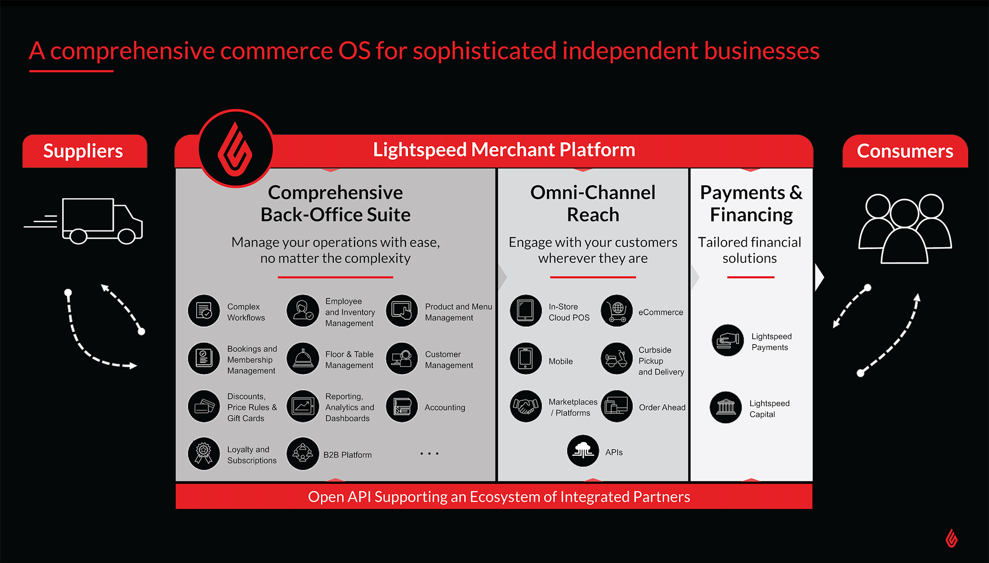
On Lightspeed’s marketecture diagram, products are grouped into three categories and aligned with the relevant organizations in their ecosystem. On the right are the end-consumers who engage restaurants and golf courses via the omnichannel products (in-store POS, curbside pickup, delivery, order ahead) in the middle column. On the left of the diagram are the suppliers to the restaurants and golf courses along with the associated back-office operation products (management of employees, inventory, tablespaces, products, and menus). Lightspeed also provides financial solutions such as payment processing and small business loans as illustrated on the far right.
- Layout – Horizontal columns
- Power phrases – For three product group columns
- Colors – Shades of gray to differentiate product groups
- Iconography – Extensive throughout all layers
- Products and platform features
- End-customers
- Value chain (suppliers)
15) MeridianLink
MeridianLink is a fintech platform focused on lending products such as mortgage, credit card, personal, auto, home equity, and small business loans. They sell primarily to banks, credit unions, mortgage lenders, and specialty lending providers who are seeking to offer a low-friction, digital experience to customers.
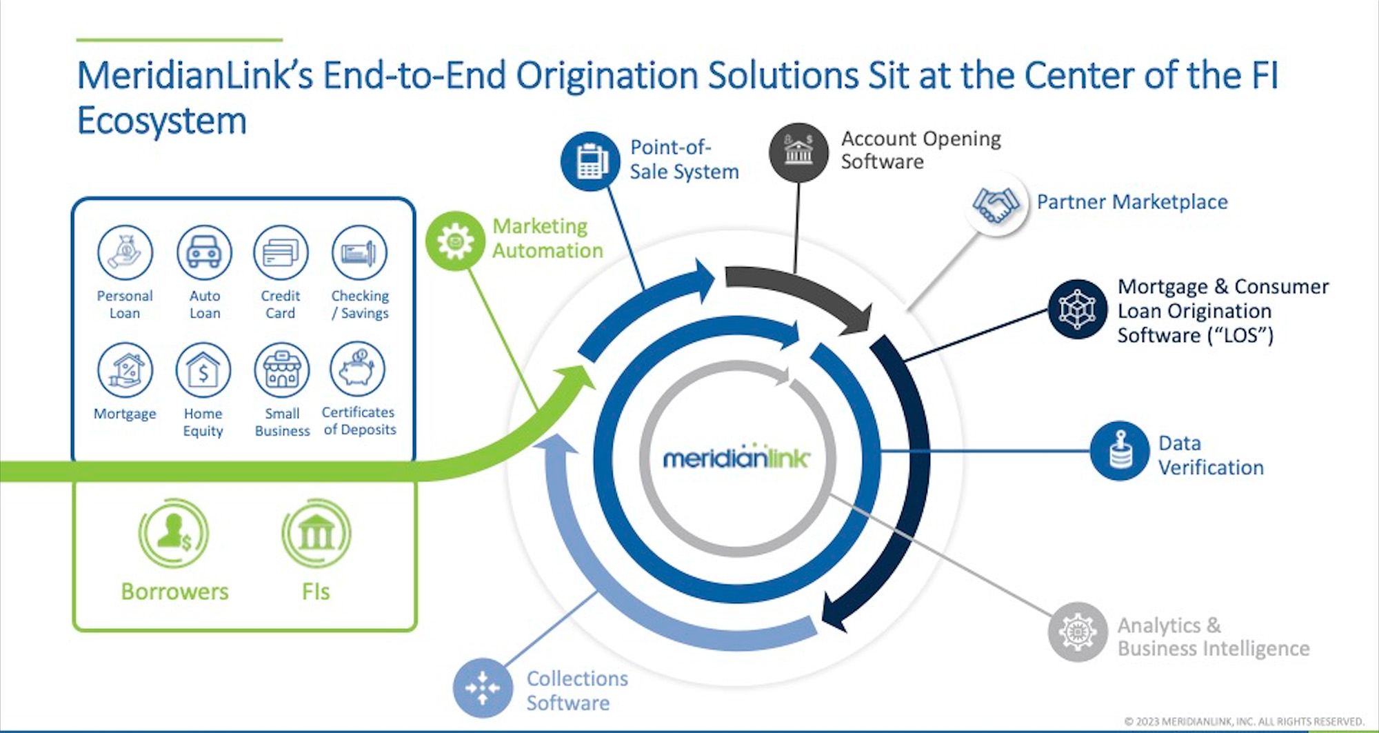
Meridian’s marketecture diagram is a powerful and creative illustration of how the products layer on top of each other as well as how they relate to the customer lifecycle. The financial institution customers (represented by their product lines – personal loan, auto loan) are on the left as well as the end-customer (consumer) seeking the loan. Information from the consumer flows into the center part of the diagram and then clockwise around the circle with the customer’s lifecycle. The flow starts with new customer acquisition activities (e.g. marketing automation, account opening) then post-sale fulfillment (mortgage origination and data verification), and finishes with collections. Note how the business applications on the outer rings of the concentric circles layer atop the analytics and data verification services in the middle.
- Layout – Concentric circles
- Power phrases – None
- Colors – Represent different stages of customer lifecycle
- Iconography – Extensive throughout diagram
- Products and platform features
- End-customers
- Customer product lines
- Business process lifecycle (lending)
16) Oracle
Oracle is one of the top 10 technology mega-vendors selling everything from on-premise server hardware and cloud infrastructure to horizontal and vertical industry-specific business applications. They sell to everyone from small businesses to Global 100 corporations and large government agencies.
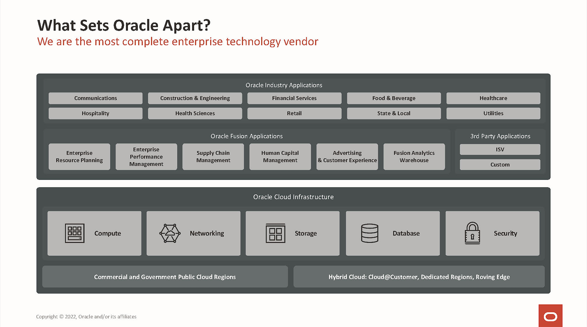
Oracle’s marketecture diagram is not flashy. It uses just a few shades of gray and minimal iconography. I suspect this is the version they use with investors and there is a more colorful, splashy version in the field organization. Nonetheless, Oracle doesn’t need flair, with such a powerful brand and suite of capabilities. The marketecture diagram is a typical vertical stack orientation with the cloud infrastructure (compute, storage, network, database, security) along the bottom rows and the business applications layer on top. There are two tiers of applications – 1) cross-industry “horizontal” apps such as ERP, supply chain, human capital, advertising, and CX. The horizontal apps are branded as Fusion. The top tier is industry-specific apps for verticals such as telecom, healthcare, retail, and financial services.
- Layout – Vertical stack
- Power phrases – None
- Colors – Minimal variations
- Iconography – Used in bottom layers
- Product categories and platforms
- Environments supported (commercial and government public cloud regions)
17) PagerDuty
PagerDuty helps IT and DevOps teams quickly respond to incidents or avoid them altogether. The Operations Cloud monitors signals from the various devices and systems in a company’s IT ecosystem and uses machine learning to predict or avoid issues such as performance degradation or customer downtime.
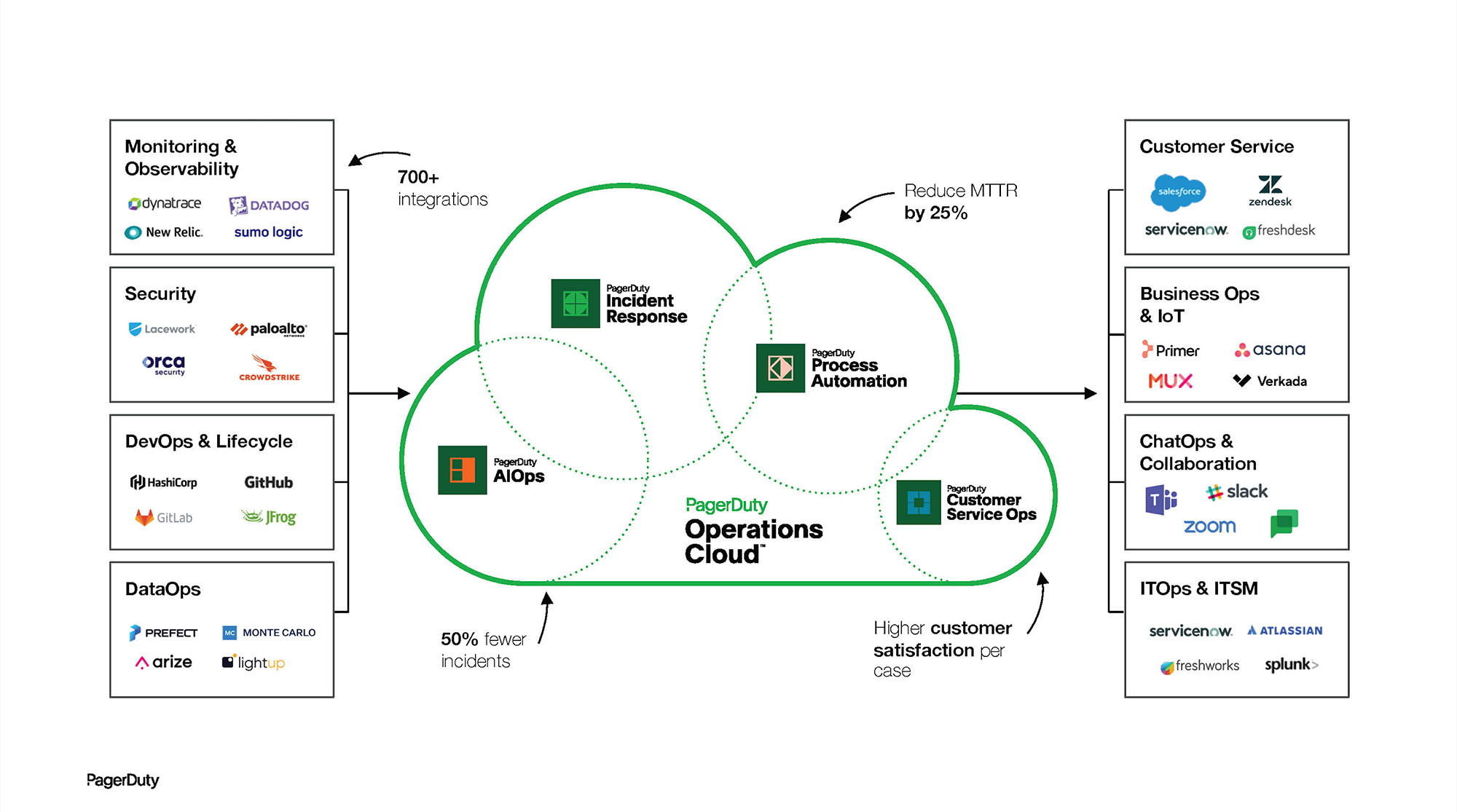
The centerpiece of the PagerDuty marketecture diagram is the Operations Cloud with four key capabilities highlighted (AIOps, Incident Response, Process Automation, Customer Service Ops) along with the associated value statements (50% fewer incidents, reduced mean-time-to-repair by 25%). A significant amount of real estate on the diagram is allocated to the various 3rd party clouds and applications that can be connected to PagerDuty, which re-enforces the library of 700 integrations as one of the company’s key differentiators.
- Layout – Unique shape (cloud)
- Power phrases – 50% fewer incidents, reduce MTTR by 25%
- Colors – None
- Iconography – Used next to four key product categories
- Product categories and platform features
- Application ecosystem
18) Paylocity
As its name suggests, Paylocity is best known for its payroll processing services, but the company offers a full suite of Human Capital Management (HCM) applications. Paylocity sells primarily to small businesses and enables them to automate core human resources processes – from the initial recruiting and onboarding through time and attendance management to compensation and benefits.
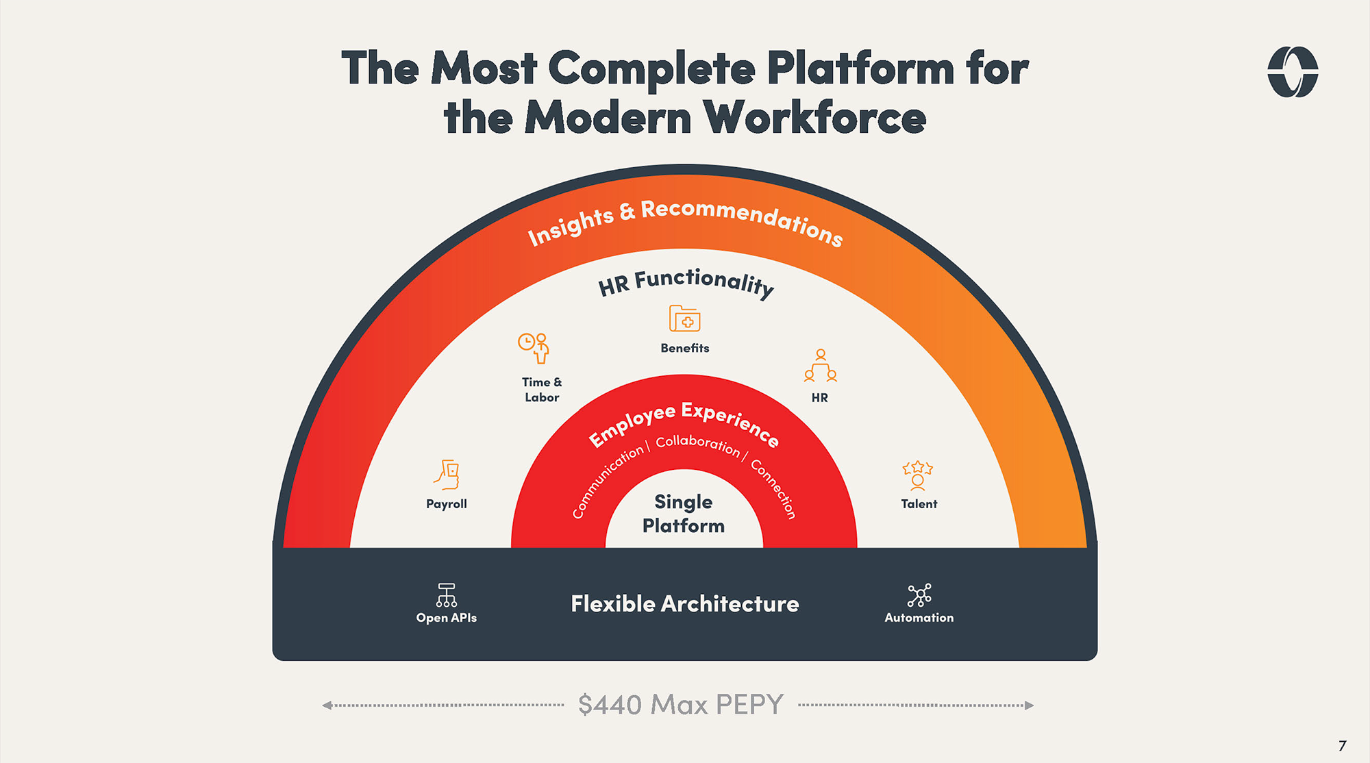
Paylocity’s marketecture diagram illustrates the product capabilities as well as promotes the value proposition the company offers. The five key applications (payroll, time & labor, benefits, HR, and talent) are the focal points of the diagram. The value proposition of improving the employee experience for end-users and unifying the administration for HR into a single platform with a flexible architecture is highlighted in the lower sections.
- Layout – Concentric semi-circle
- Power phrases – Embedded in diagram
- Colors – Darks to draw attention to selected layers
- Iconography – Used in selected layers of stack
- Product categories and platform features
19) Procore
Procore is a vertical SaaS application designed for the construction industry. Its platform supports the full lifecycle of construction projects connecting various stakeholders (owners, general contractors, specialty contractors) and providing them with a shared view of project status, financials, and compliance data.
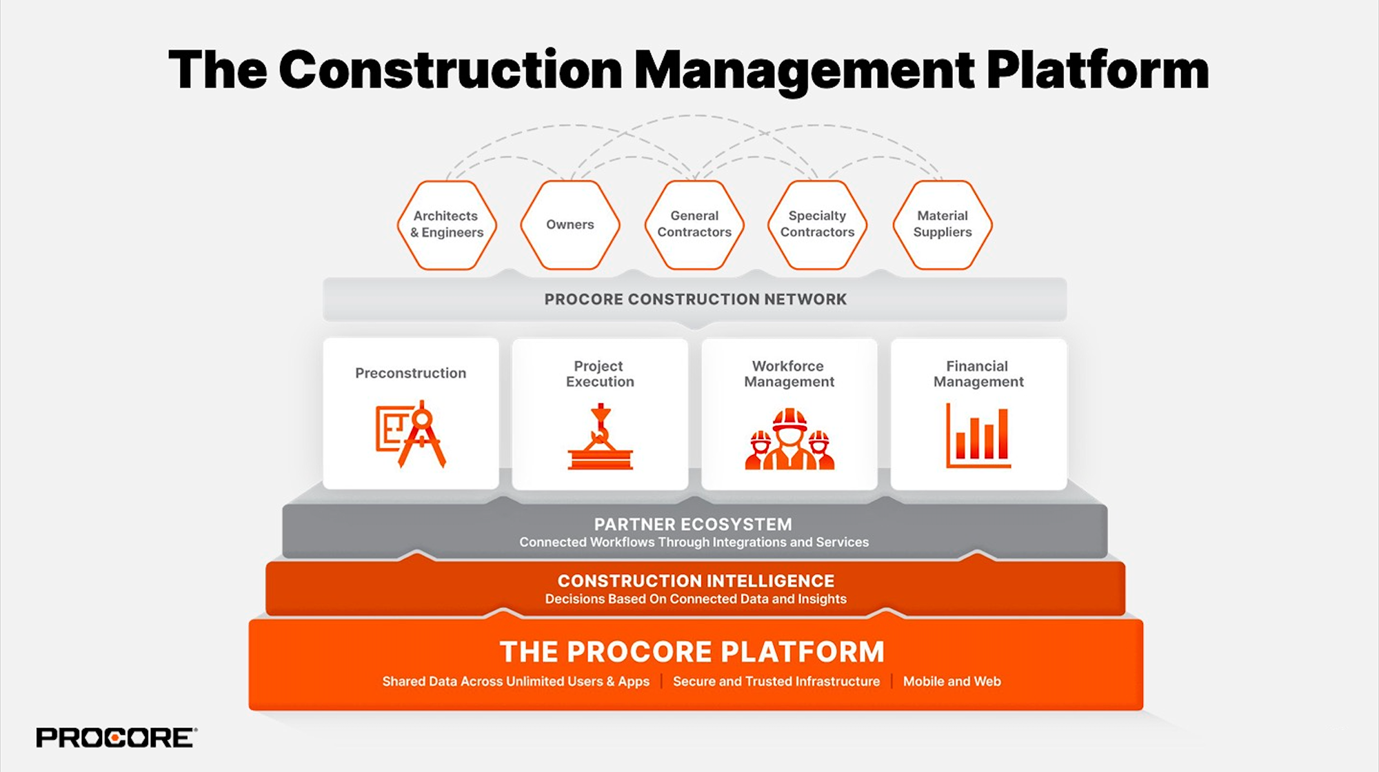
Procore’s marketecture diagram follows the traditional paradigm of using platform services as the foundation, but the second layer deviates from the norm with business (construction) intelligence placed lower in the stack. Putting the BI/analytics in the middle frees up the top of the diagram to illustrate the complex set of information flows that Procore facilitates between architects, engineers, owners, suppliers, as well as general and specialty contractors. The centerpiece of the diagram showcases the four key product capabilities of the Procore suite (preconstruction, project execution, workforce management, and financial management).
- Layout – Vertical stack
- Power phrases – Embedded in diagram
- Colors – Differentiate layers of the stack
- Iconography – Used selectively for key product lines
- Products and platform features
- Value chain (architectures & engineers, owners, general contractors)
20) Qualtrics
Qualtrics is often credited with creating the category of experience management software. The software helps organizations identify bad customer or employee experiences by analyzing survey responses, contact center chats, social media posts, and proudct reviews.
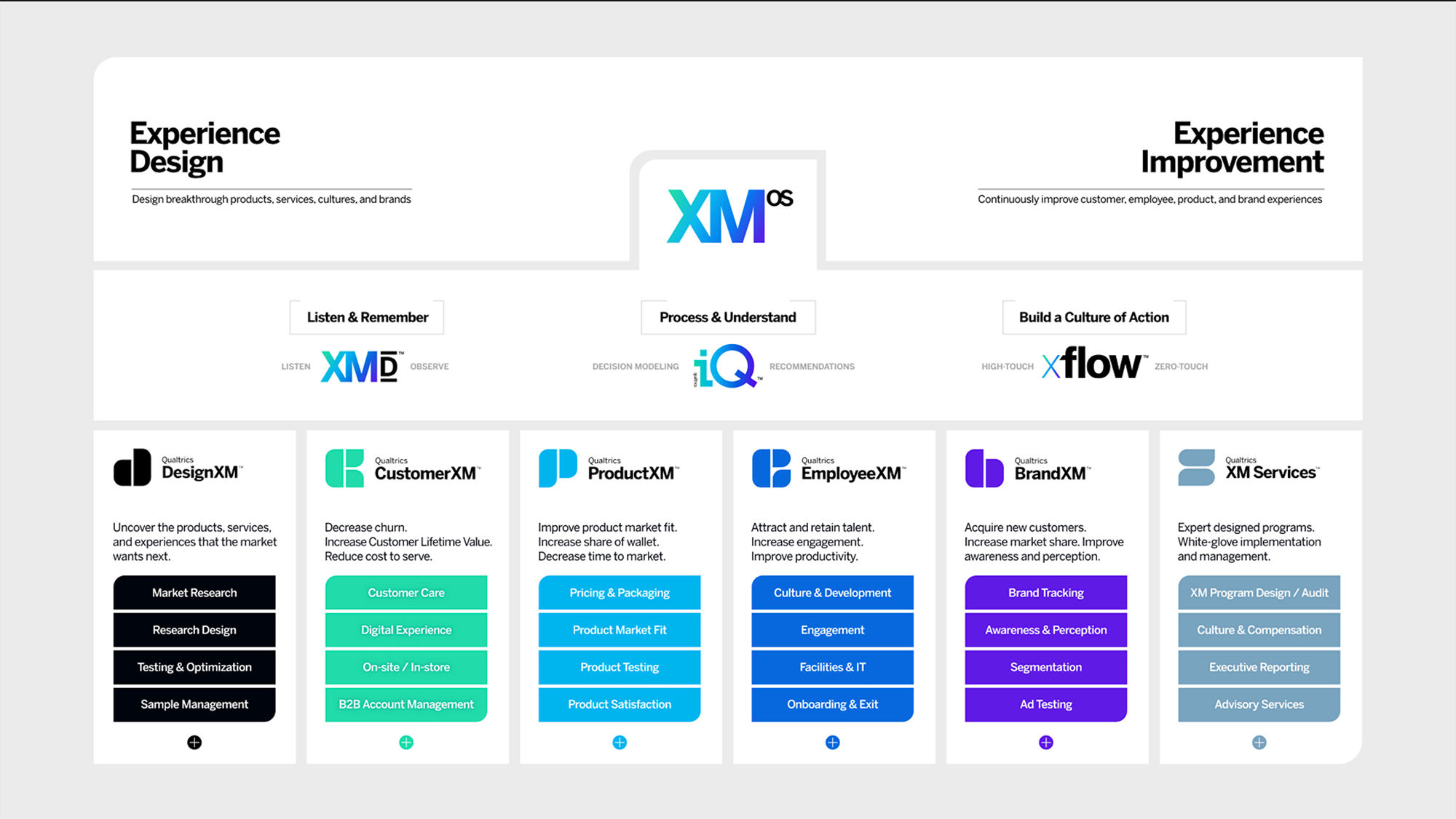
The Qualtrics marketecture diagram is a work of art that symmetrically lays out its core value proposition, product lines, and branding architecture in a single slide that is easy to read. Across the bottom are the six key product categories each represented by a different color, icon, and brand name (DesignXM, ProductXM). The middle tier has three key sections. The first two contain power verbs – “listen and remember” and “process and understand.” The third one is powerful as well, explaining how Qualtrics enables its customers to “build a culture of action” to respond to experience issues quickly. At the top, the company explains its two core propositions – design experiences and improve them.
- Layout – Column
- Power phrases – Listen & remember, process & understand
- Value statements – Embedded throughout diagram
- Colors – Different color used for each product suite
- Icon – None, but unique favicons created for each product suite
- Products and platform features
- Value chain (architectures & engineers, owners, general contractors)
21) SEMRush
SEMRush helps marketing organizations improve their organic search engine rankings and digital advertising results by crawling the entire web and collecting trillions of data points about the content end-users are seeking and consuming. SEMRush refers to this as online visibility management.
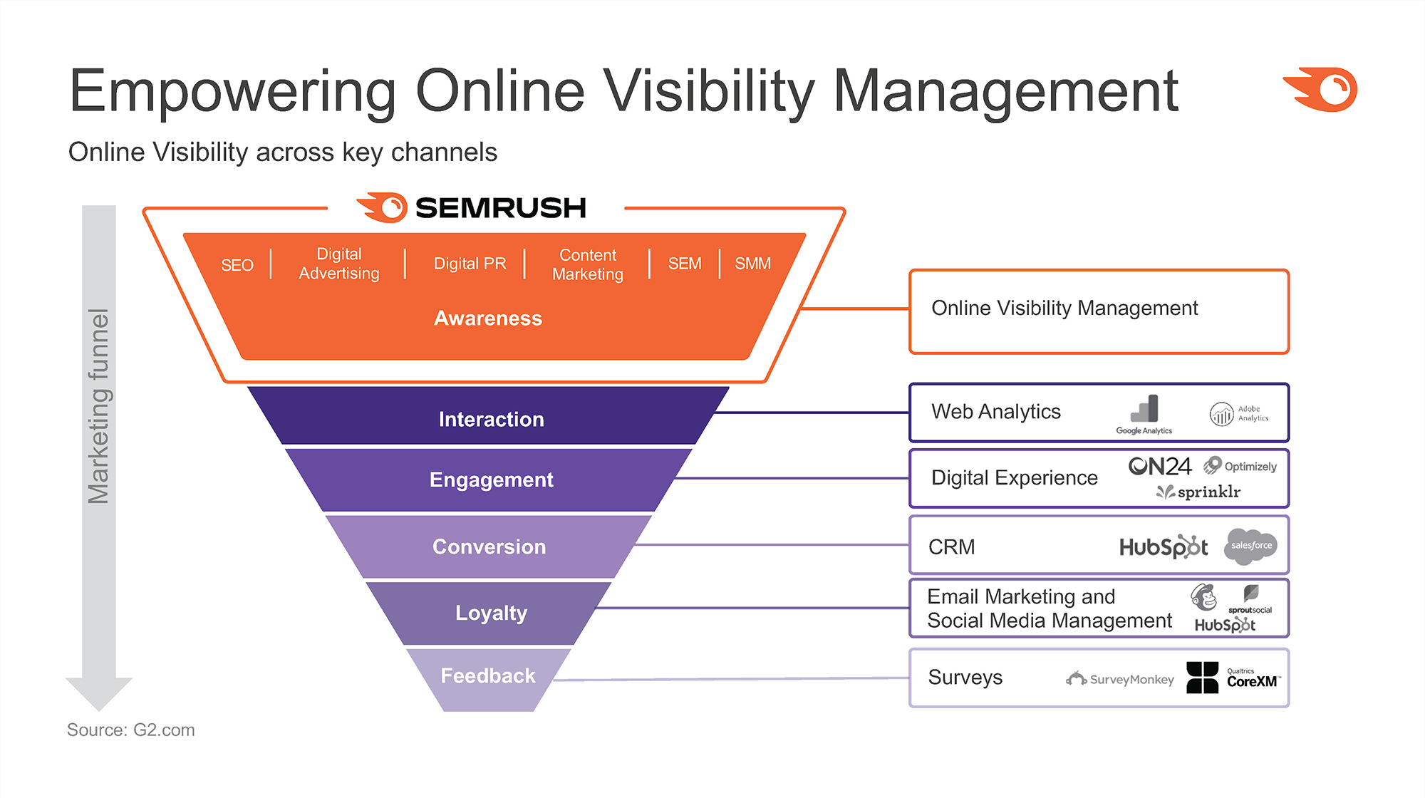
SEMRush’s diagram focuses more on its ecosystem than the details of its stack. The centerpiece of the diagram is the familiar marketing funnel which explains how buyers progress from gaining awareness of a company to interacting and engaging and finally converting into a sale. At each stage of the funnel, the diagram highlights a few of the more popular Martech applications in use today. SEMRush positions itself at the top of the funnel, helping to build awareness through its search engine optimization, digital advertising, content marketing, search engine marketing, and social media management capabilities.
- Layout – Funnel inverted
- Power phrases – Embedded in funnel
- Value statements – Online visibility across key channels
- Colors – Variations for each layer of funnel
- Icons – None
- Products and platform features
- Business process lifecycle (marketing funnel)
- Application ecosystem
21) SolarWinds
SolarWinds helps IT and DevOps organizations monitor and manage their IT infrastructure to quickly identify problems as they arise and proactively prevent others from occurring.
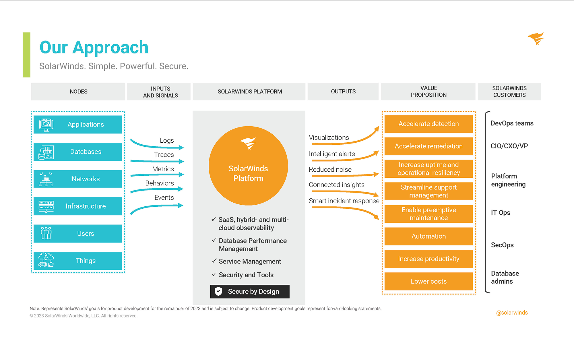
SolarWinds provides an ecosystem diagram that illustrates information flows through the application and the customer value proposition. Starting on the left are the various IT infrastructure nodes that are monitored and managed (applications, databases, networks, users, things). A set of inputs and signals (logs, traces, metrics) are collected and routed into the SolarWinds platform for observation and problem identification. The outputs of the analysis (visualizations, alerts, incident responses) are routed to the end-users on the far right of the diagram (DevOps, platform engineering, database admins). One differentiated approach SolarWinds has taken is to insert the value proposition of its platform into the core of the diagram (as represented by the yellow boxes on the second-to-left column).
- Layout – Information flow
- Power phrases – None
- Value statements – Embedded in the diagram
- Colors – Different for inputs and outputs
- Icons – Selective use in the nodes column
- Application ecosystem
- User community
22) SumoLogic
SumoLogic’s platform helps DevOps and security teams glean insights from the vast amounts of data generated by their business applications and IT infrastructure. Examples include pinpointing the root cause of performance issues in applications, recognizing network traffic patterns to detect threats, and identifying opportunities for better customer experiences in business applications.
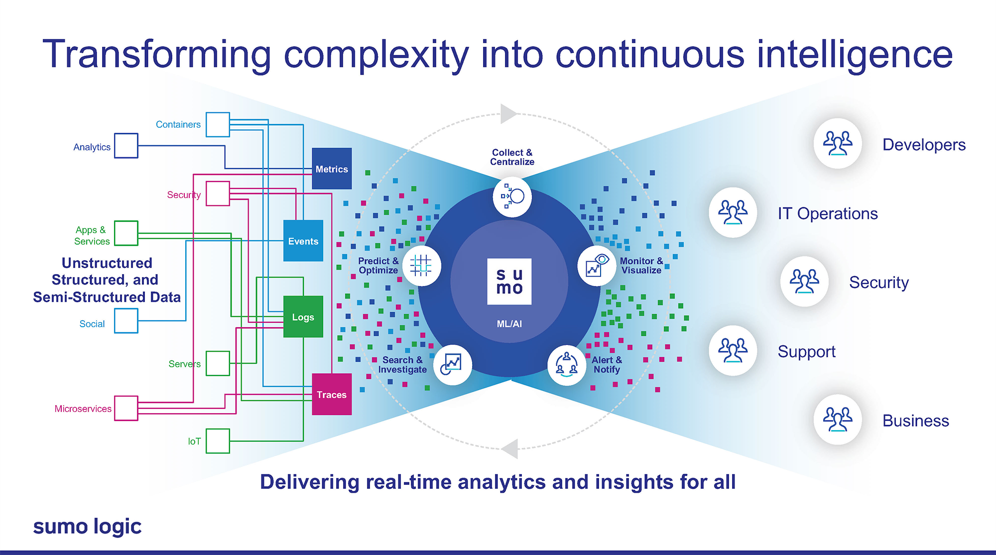
The left of the diagram illustrates a stream of metrics, events, logs, and traces coming from various devices, applications, and external systems. These are fed into the SumoLogic platform, the centerpiece of the diagram, which uses concentric circles and power verbs (collect & centralize, monitor & visualize) to communicate the value proposition. The inputs are synthesized into more useful outputs and fed to the user communities depicted on the right. Note how the inputs represented by small colored boxes on the left are converted from random, chaotic patterns to organized data streams on the right.
- Layout – Information flow
- Power phrases – Collect & centralize, monitor & visualize, etc.
- Value statements – Delivering real-time analytics…
- Colors – Used to represent metrics, events, logs, traces
- Icons – Selected use to represent key capabilities
- Application ecosystem
- User community
23) Toast
Toast provides a full suite of applications for restaurants from marketing and customer loyalty programs to point of sale and payment processing to back office accounting and supply chain management.
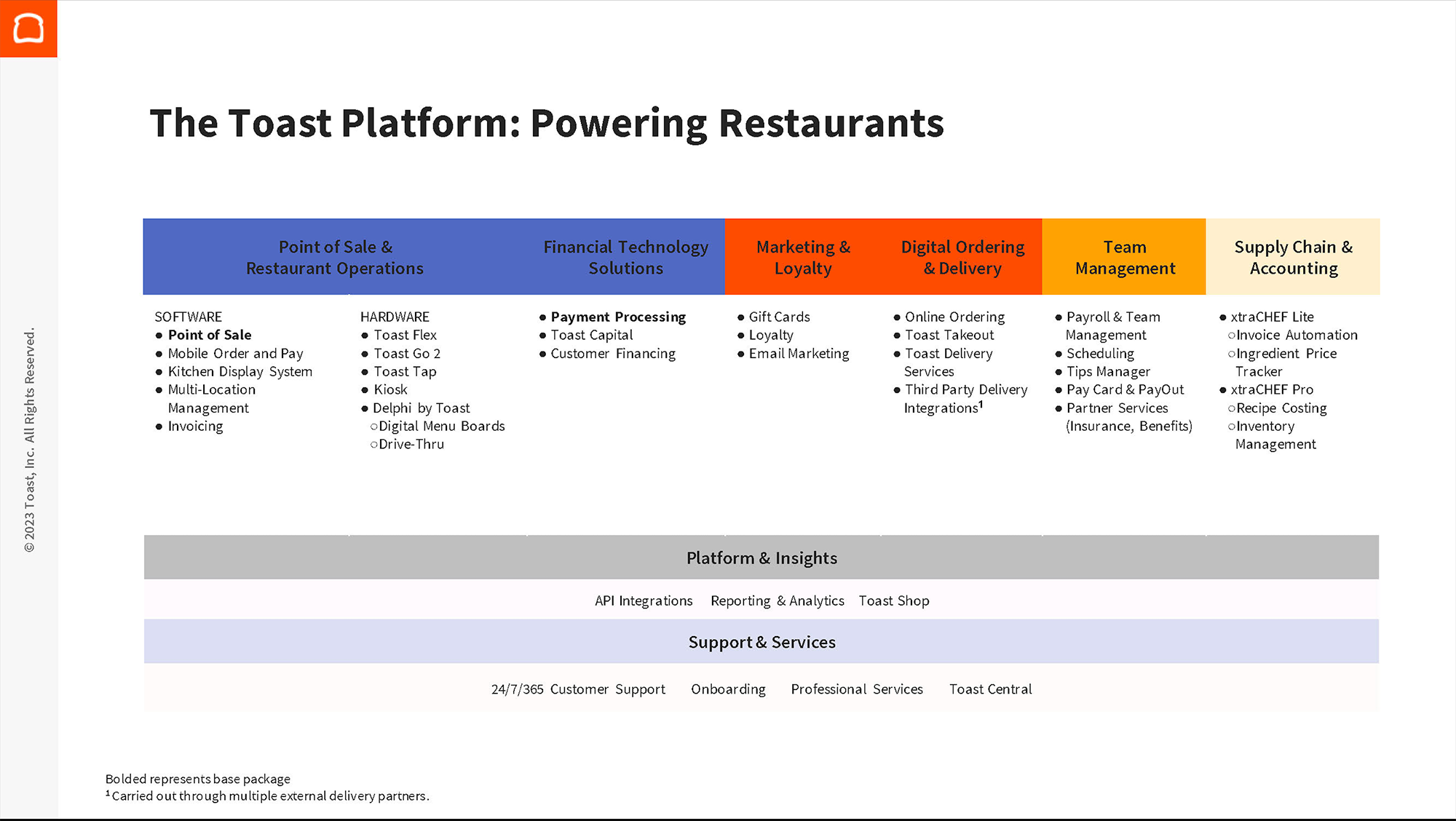
Toast’s marketecture diagram uses an overly simplistic design style devoid of icons or flashy graphics. Nonetheless, it does an excellent job of organizing and explaining the breadth of product capability the company offers. Across the top are the key product offerings starting on the left with the company’s core point of sale hardware and software for which it is best known. Moving from left to right the diagram Toast displays the numerous value-added services it can offer to grow customers. At the bottom are the platform (reporting, APIs) and support services (professional services, onboarding).
- Layout – Vertical stack
- Power phrases – none
- Value statements – None
- Colors – Used to represent different layers
- Icons – None
- Product and platform features
24) VTEX
VTEX provides an electronic commerce platform for retailers and brands to run B2C and B2B online stores as well as marketplaces.
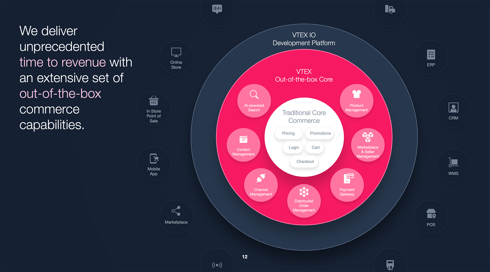
VTEX uses a hybrid marketecture-ecosystem diagram, which does a nice job of illustrating its product capabilities, platform differentiators, and context about how customers and suppliers interface with the technology. The center of the diagram consists of three concentric circles. The innermost, white circle represents the minimum viable product feature set that every e-commerce platform offers (pricing, cart, checkout). The middle circle, in eye-catching pink, highlights the differentiated features of VTEX’s products (AI-powered search, distributed order management). The white is “the stuff all the other guys do” and the pink are the features only VTEX offers. On the left are the omnichannel experiences for consumers to interact in a physical store, mobile app, or web store. On the right are the customer’s other business applications (warehouse management, point of sale).
- Layout – Concentric circle
- Power phrases – None
- Value statements – None
- Colors – Pink for VTEX capabilities, gray for external
- Icons – Used extensively throughout diagram
- Product and platform features
- End-customers (channels)
- Application ecosystem
25) ZoomInfo
ZoomInfo provides data and intelligence that enable sales and marketing organizations to identify the best targets for new customer acquisition, expansion, and growth. In addition, ZoomInfo leverages its massive database of companies, decision-makers, and news feeds to enable recruiters to identify the best talent for open roles they are trying to fill.
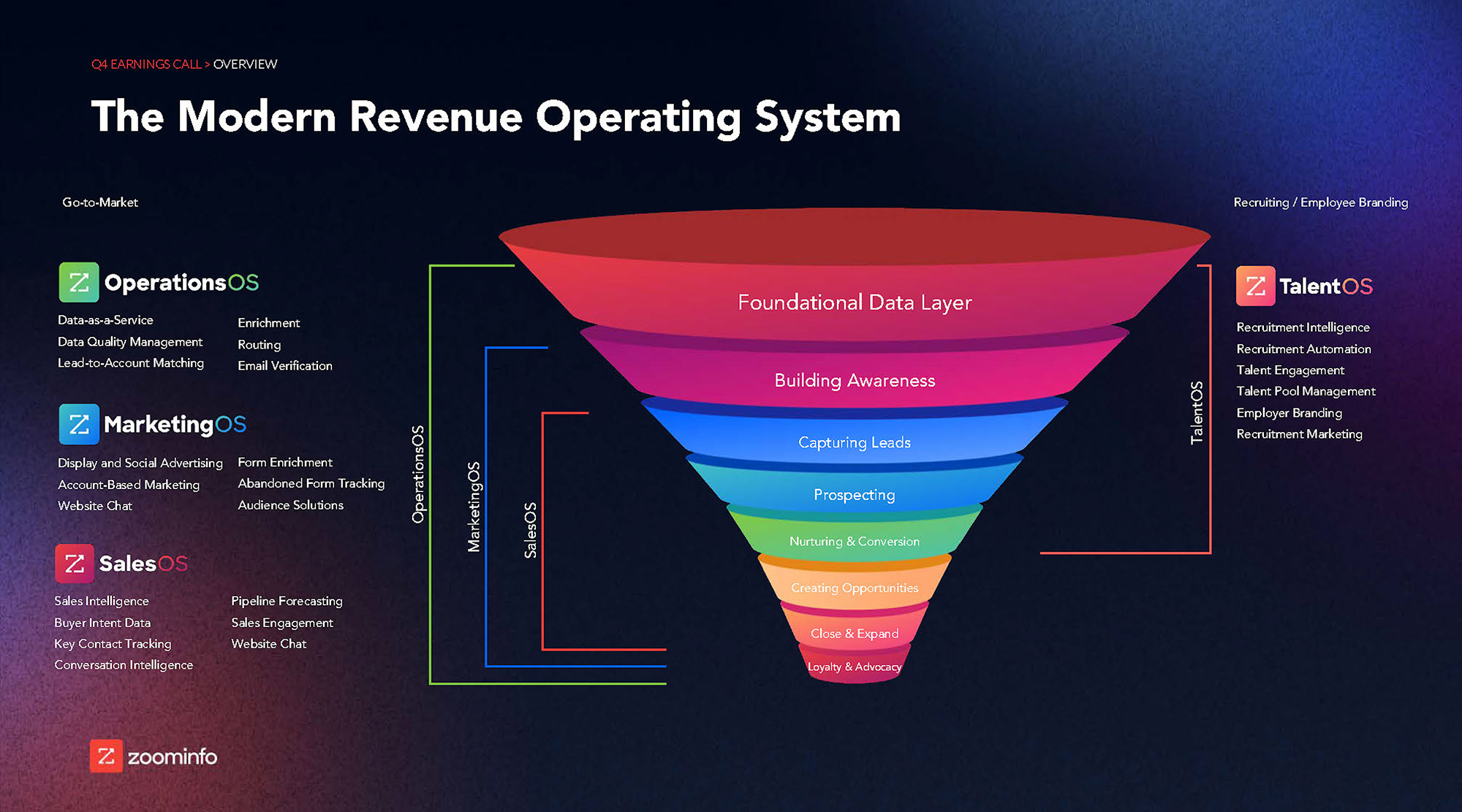
ZoomInfo’s marketecture diagram does an excellent job of illustrating both the company’s product capabilities and their context in the customer’s business processes using a visually compelling set of icons, diagrams, and colors. The centerpiece of the diagram is the funnel, which is applicable for both sales and marketing as well as the talent scenario. The colored brackets to the left and right of the diagram explain how the four product lines (OperationsOS, MarketingOS, SalesOS, and TalentOS) are used at various stages of the sales or recruiting lifecycle.
- Layout – Funnel
- Power phrases – None
- Value statements – None
- Colors – For marketing funnel layers
- Icons – None
- Product and platform features
- Business process lifecycle – marketing funnel