
Marketecture diagrams can be an extremely powerful tool to communicate the value of your platform, the breadth of your product line, and the differentiating features of your technology. But designing a good marketecture diagram is not an easy thing to do. You need to represent your company’s entire value proposition on a single slide. Companies usually want to include a lot more information than there is space to display it. Success requires being hyper-selective about each word and concept represented on the diagram. A marketecture diagram needs to be easy to read. If it is cluttered with too many words, icons, and shapes, the audience won’t be able to decipher it. There needs to be enough detail to make a strong impact with the target audience, but not so much detail that it overwhelms and confuses them.

Goals and Outcomes
What makes a good marketecture diagram?
A good marketecture diagram enables your team to tell a story. The CEO should be able to use it with investors. The sales team should be able to use it with large accounts. The product team should be able to use it with analysts. The story can be customer-centric, showing a typical ecosystem and how you fit into it to solve a big problem. Or it can be about the vision for the market and how your platform has evolved over time to meet the needs.
A good marketecture diagram explains your product strategy. As you walk through the layers of the stack, there is usually a narrative about how the company began and where it is going. A good marketecture diagram is forward-looking often including a few capabilities that aren’t fully commercialized. There should be a few roadmap items on the diagram that make the engineers nervous.
A good marketecture diagram explains your growth strategy. It paints a picture for the customer of all the different areas you can help them. It frames you as a strategic partner rather than just another vendor. It guides the sales team on the “land and expand” strategy. It shows the most likely entry points for initial customer adoption and the various upsell/cross-sell paths to grow revenues. It provides investors with a confidence that you can not only acquire new customers but grow their revenue over time.
Example of a Good Marketecture Diagram
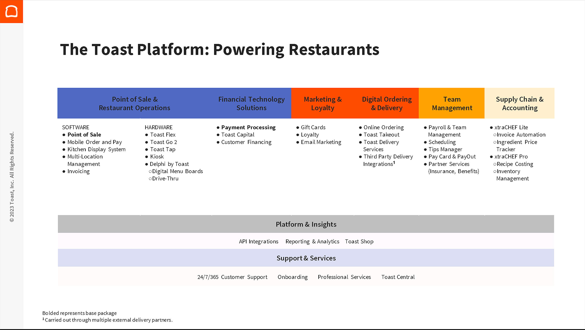
The restaurant technology platform, Toast, has a marketecture diagram that tells a good story. The segmentation of the products allows sales reps and executives to explain the company’s product strategy past, present, and future. The company started with its flagship point-of-sale and restaurant operations products. Over time they added additional revenue-generating services such as payment processing, digital storefronts, and customer financing. The future is about building a suite of apps to support the entire business from customer-facing loyalty programs and gift cards to back office functions like employee payroll supply chain.
The Design Team
Who to include when you are designing a marketecture diagram
At most companies, the best approach to designing the marketecture diagram is keeping the team to a small group with the right skills. There are two key skills you need on the core team.
- Functionality – You need someone who understands the product inside and out including the competitive differentiators, the customer pain points, and the roadmap for new functionality. This may be someone in product management/ product marketing or it could be someone in sales/solution consulting. At a smaller company it may be the founder/CEO.
- Design – You need someone who is good at visualizing abstract concepts. This could be someone on the branding or creative design team, but it doesn’t have to be. For example, I have found many of the CTOs I have worked with are really good at organizing the platform features into layers of a stack diagram.
Five Things to Consider When Designing a Marketecture Diagram
Use case, story, content, design, and differentiation
Before you begin designing a marketecture diagram, it is a good idea to review examples of tech stack diagrams from other companies. Identify which of the example marketecture diagrams you think are the best. While reviewing the examples, take note of what you like and do not like about each of the diagrams.
- Use Case—Who do you want to show the diagram to? Customers? Investors? Employees? Where will the diagram be shared—presentations, website, collateral? Who will present the diagram and tell the story most frequently?
- Story – What type of story do you want to tell? Do you want to focus on your product capabilities, IP, and differentiators? Or do you want to show how your technology fits into the customer’s ecosystem?
- Content – What level of detail do you want to portray on the diagram? If you are a startup with a single product, you will want to show detailed features. If you are a large company with a suite of 10 or 20 products, you may only want to show product categories.
- Design – What is the best way to visually represent the concepts? A stack? A circle? A diamond? How will you make the diagram visually appealing? Will you include icons? Logos? Colors? Is there a line or two of text that needs to be included to explain the value proposition?
- Differentiation – Which individual products or product categories do you want to highlight? Are there key differentiators that you want to draw attention towards? A new product release, a differentiated feature, or recent acquisition?
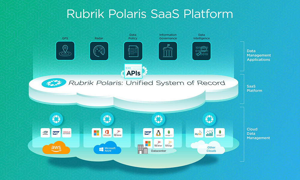
- Use Case – It has the right level of detail to use with customers, investors, and influencers.
- Story – Enables a narrative about both 1) the product capabilities, and 2) how it fits into the customer ecosystem with the platforms at the bottom.
- Content – Focuses on the five key capabilities of the products at the top of the diagram.
- Design – Uses a nice mix of logos at the bottom, icons throughout the stack, and background colors to make the diagram visually appealing.
- Differentiation – The cloud in the center with the accompanying text calls the viewer’s attention to the branded “Polaris” platform name and key value statement.
In the following sections, we will discuss each of these five considerations for designing a marketecture diagram in further detail and present real-world examples from leading technology companies.
Design Consideration #1
Use Cases
Audience and Context
- Customers – When competing for new accounts or upsell business at existing accounts, there is often a need for the sales team to present the company’s vision and strategy. The marketecture diagram provides a concise, single-slide format for illustrating the breadth and depth of the company’s product line.
- Investors – When fundraising from public/private investors or seeking an exit to strategic/financial buyers, there is often a need to show how the company’s strategy addresses a large potential market (TAM) and enables expansion revenue with existing customers.
- Employees – When speaking to employees at SKOs, town halls, or company-wide meetings there is often a need to show how all the products fit together into a cohesive strategy. Employees want to understand how the projects they are working on are contributing to the overall business strategy.
- Analysts – When pitching opinion leaders on your company’s product suite and strategy there is often a need to show a stack diagram to explain how all the features fit together. Marketecture diagrams help analysts, consultants, and other influencers to understand your product capabilities and differentiators.
Next, think about where you will be displaying the marketecture diagram. In some cases, the diagram may be included in a presentation with an accompanying narrative. In other cases, it may be discovered online and will need to be self-explanatory to the audience.
- Conferences – Marketecture diagrams are often shared at big conferences. Those might be industry tradeshows, user conferences, or investor days. The CEO or CTO will often share the company’s vision and product strategy.
- Website – Its less common to see marketecture diagrams on corporate websites these days. Sales teams want customers to engage with them in a guided-buying process before sharing details about the full capabilities and roadmap.
- Sales Cycles – Much of today’s sales process focuses on showing the customer live product demonstrations. However, marketecture diagrams can be useful to illustrate concepts that are not visible from the UI and to differentiate key platform features.
Design Consideration #2-3
The Story and the Content
Product-Centric vs Customer-Centric Marketectures
Product-Centric – Capability Focus
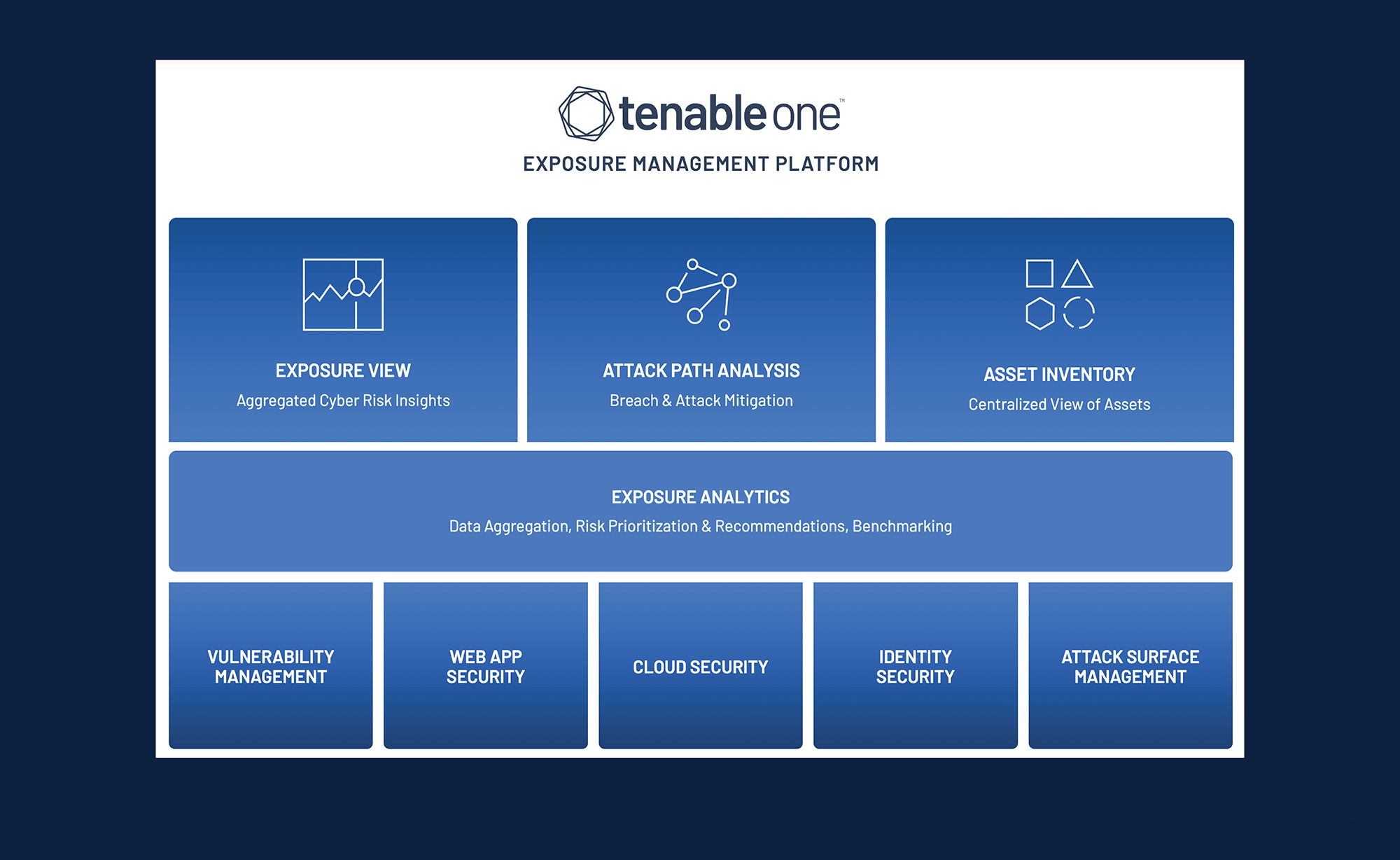
Most marketecture diagrams are product-centric. The content is focused on the product capabilities, the underlying platform, and the detailed features. There may be references to external applications to show key integrations, but the focus is on what happens inside the product.
For example, Tenable illustrates its product capabilities in a three-layer stack diagram.
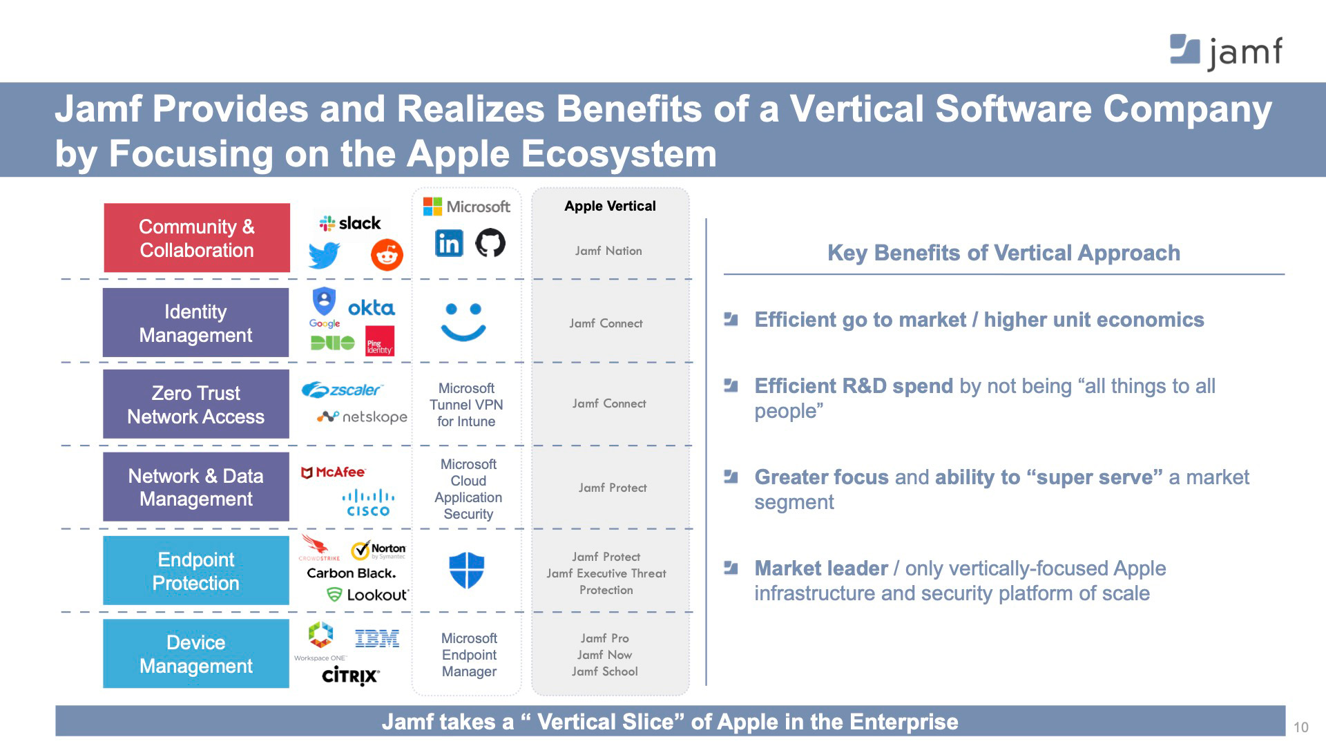
Customer-Centric – Ecosystem Focus
However, some marketecture diagrams are more ambitious. These diagrams attempt to show not only the company’s capabilities but also how the product interacts with the customer’s ecosystem. The ecosystem could be the end-user community, the value chain, or the customer’s business processes.
For example, Jamf illustrates how its products connect to the other popular management and security tools that most enterprises purchase
The Story and the Content
Product-Centric Marketecture Diagrams
Single Product vs Multi-Product
Single Diagram, Multi-Product
One of the key considerations in designing a marketecture diagram is the level of detail to show. The detail level will vary depending on the size of the company and the scope of its portfolio. For example, if you have 100 different products, the marketecture diagram is likely to show only high-level product lines. Fitting 100 different SKUs into a single diagram is challenging and even if you are successful, the result will be quite an eye chart.
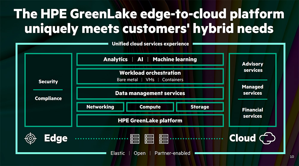
HPE GreenLake has thousands of SKUs, but simplifies its many different products and configurations into an easy-to-read stack diagram with all the key product categories
Multiple Diagrams, Multi-Product
If there is too much detail to represent on a single slide, you can create separate marketecture diagrams for each of your key product lines.
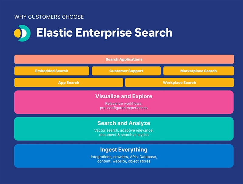
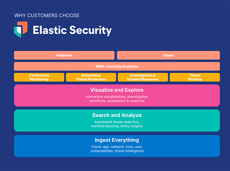
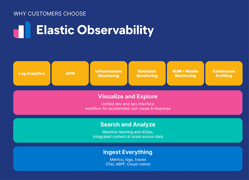
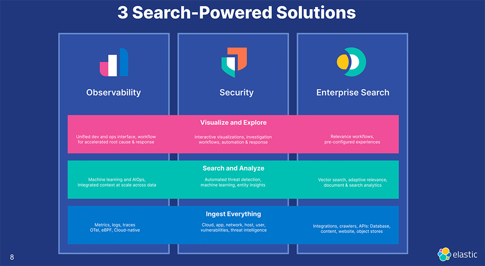
For example, Elastic has separate its search, observability, and security product lines
Single Diagram, Single Product
However, if you only have a handful of products then your best approach when designing a marketecture diagram is to focus at the sub-product level with more detailed capabilities and features.
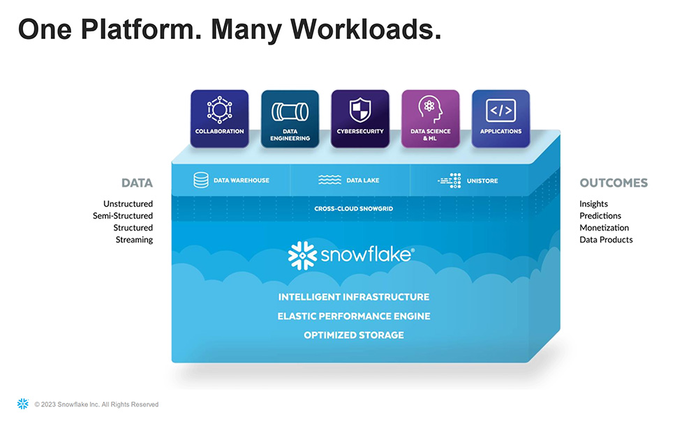
Snowflake’s marketecture diagram focuses more on capabilities and features than the actual product SKUs you would see on a sales order.
The Story and the Content
Customer-Centric Marketecture Diagrams
End-Users, Tech Stack, Business Processes, and Value Chains
Ecosystem diagrams are customer-centric. They show the product, but also how the customer’s 1) end-user community will use it along with their 2) existing tech stack to automate 3) business processes across the 4) value chain. Most ecosystem diagrams are not able to illustrate all four concepts, but focus in on 1-2 elements.
Use Cases and/or End-Users
One common approach is to include the end-user community on the marketecture diagram, particularly if there are multiple groups that benefit from the product. For example, an application that provides deep functionality for a technical organization such as DevOps may highlight that other teams such as the security, engineering, and IT leadership team benefit as well.
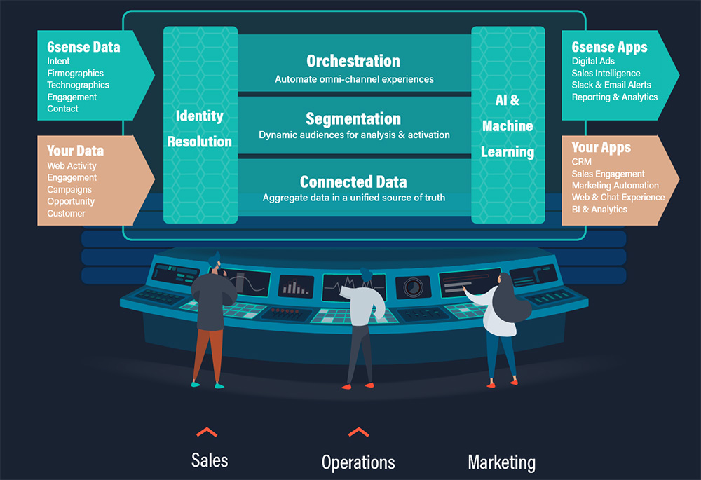
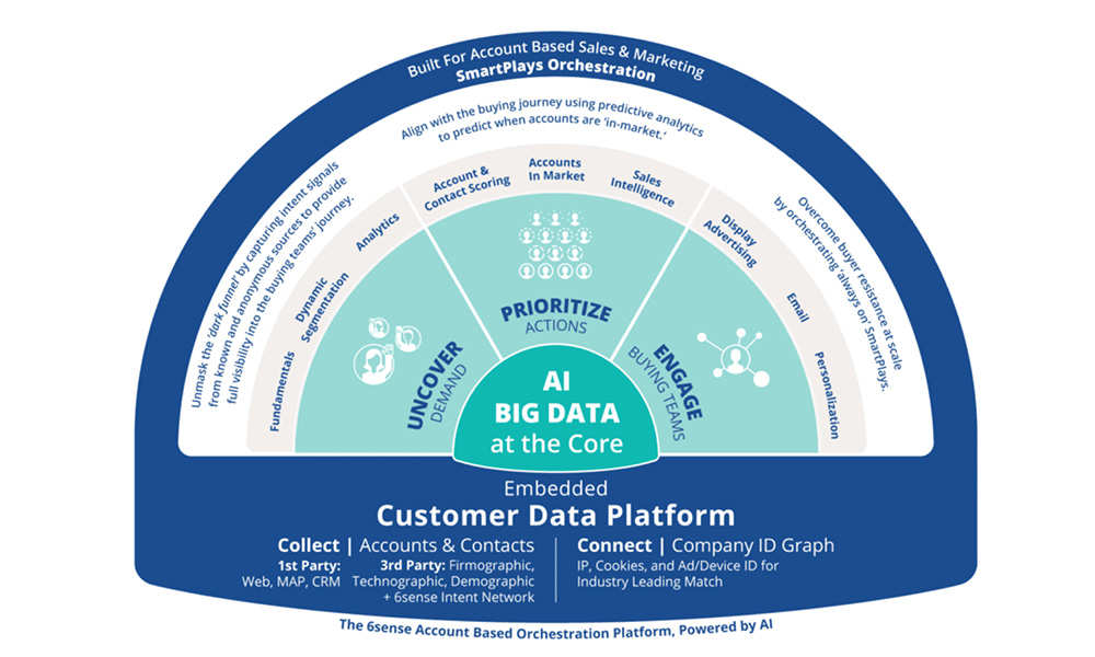
6Sense shows its three buyer personas (sales, marketing, operations) at the bottom of its marketecture diagram.
Customer Tech Stack
Another popular strategy is to show how the product(s) interact with the other applications in the customer’s tech sack. For example, cloud infrastructure companies that provide databases, AI/ML, or observability services often show how they can interact with the customer’s private or public clouds running on AWS, Azure, GCP, or Oracle. Niche business application vendors often highlight how their product integrates with a variety of popular ERP or CRM applications.
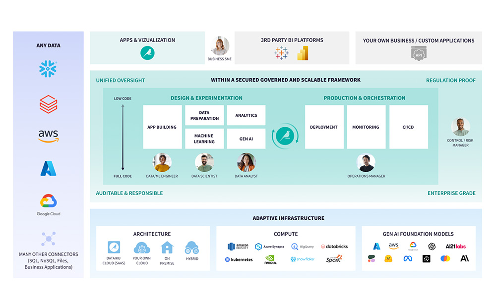
Dataiku highlights the different data sources, cloud platforms, and GenAI models it can layer on top of at the bottom of its marketecture diagram.
Customer’s Business Processes
A less common, but powerful technique is to integrate the customer’s business process lifecycle into the marketecture diagram. For example, a CRM application vendor might illustrate how their product fits into the end-customer lifecycle, helping with new customer acquisition, onboarding, service delivery, upsell/cross-sell, and retention.
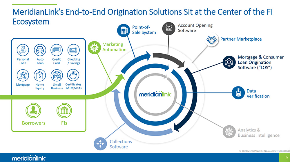
MeridianLink orients its marketecture diagram around the business process lifecycle for the consumer lending products it automates for its financial services customers.
Customer Value Chain
Some companies include their product in the context of the customer’s value chain. For example, a supply chain software company might illustrate how its product helps track the movement of goods from the supplier’s factory across multiple transportation modes to the customer’s distribution center.
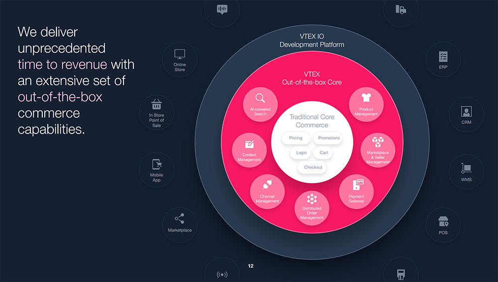
VTEX has an ecosystem diagram to show how it automates commerce across various sales channels and fulfillment models.
Hybrid Combinations
You can also create a combination of the two. Often, in business presentations, there is a desire to minimize the number of slides in a deck. In these scenarios, there isn’t an appetite to use different slides to represent the ecosystem and marketecture. As a result, the best of both is combined into a hybrid diagram that includes a simplified version of the stack as well as some elements of the ecosystem.
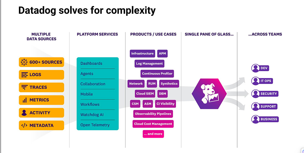
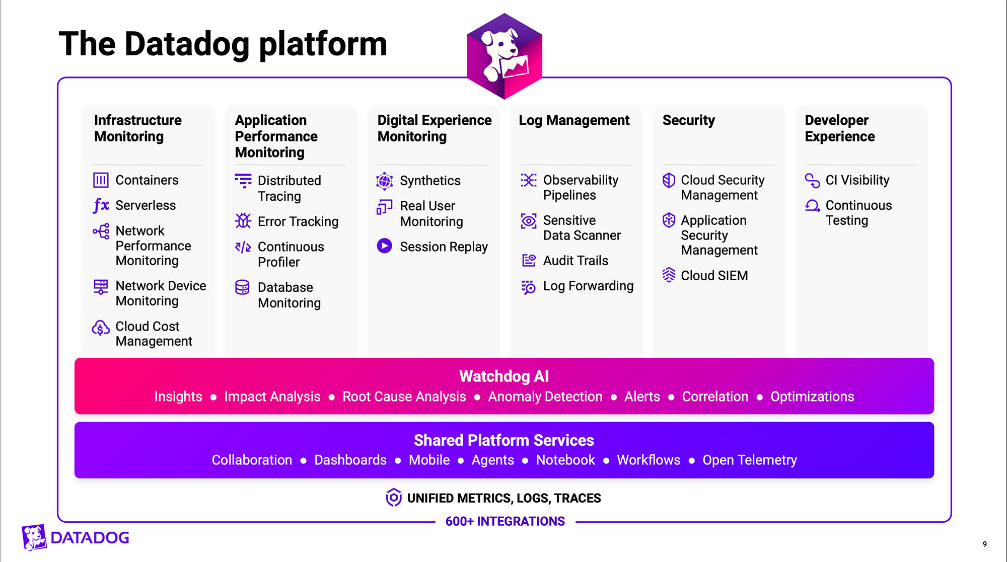
DataDog uses separate marketecture diagrams for different purposes. It has a diagram that shows the product stack and another to show how it fits into the customer ecosystem.
Design Considerations #4-5
Design and Differentiation
Tech companies need to consider the best way to use different shapes, colors, icons, and text elements when designing a marketecture diagram.
Horizontal Stack Marketecture
The most common approach is the vertical stack diagram with multiple rows or layers of capabilities. The bottom layer is foundational, often with the core feature set or platform capabilities. Each subsequent layer builds on top of the capabilities below. The highest-value features, such as industry-specific applications or analytics capabilities, are placed at the top layer.
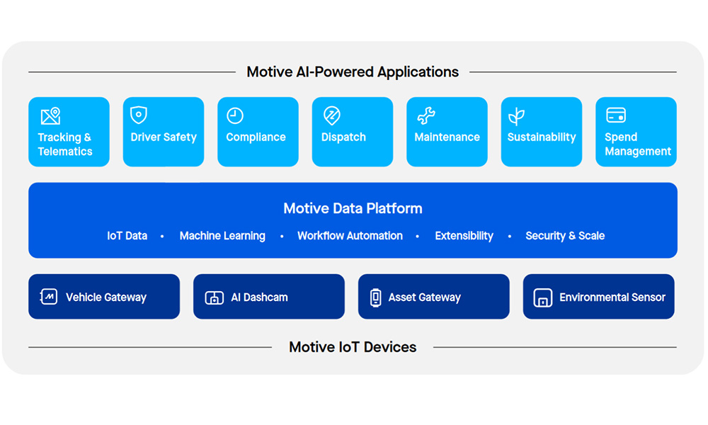
Motive, which provides fleet management, uses a traditional vertical stack diagram with three layers to illustrate how its data platform connects to IoT devices and AI-powered applications.
Vertical Columnar Marketectures
A slight variation on the vertical stack that groups products into columns rather than rows (as with the vertical stack). A column approach is best when you have multiple groups of products that are related, but do not necessarily build upon one another.
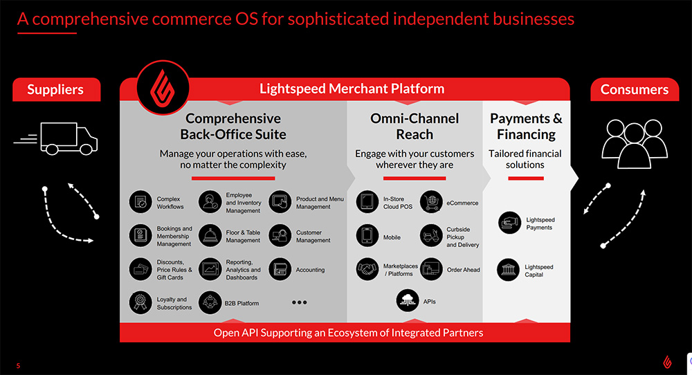
Lightspeed Commerce uses three columns to illustrate how its products are used by customers to automate back office operations, service different sales channels, and capture payment transactions.
Circular Marketecture
Some marketecture diagrams use concentric circles (or semi-circles/rainbows) to represent the different layers of the value stack. The approach is similar to vertical stack diagrams. However, instead of capabilities building from bottom to top, the value grows from the inner rings towards the outer rings of the circle.
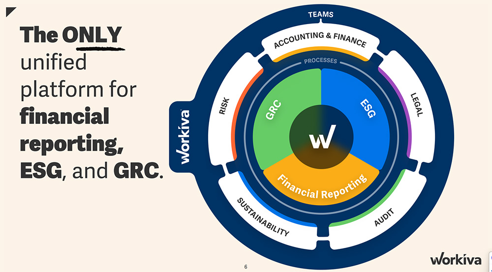
Workiva uses a compelling visual with concentric circles to illustrate the various business processes and the teams it supports.
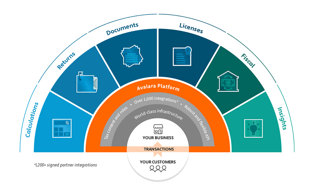
Avalara uses a semicircle to depict its six tax applications sit atop its platform, content, and integrations.
Other Shapes
Not every diagram is a layered stack, column, or circle. Some tech companies use unique shapes to differentiate their offerings and stand out from the crowd.
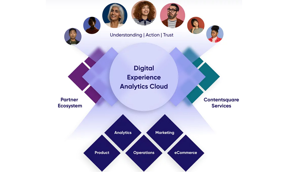
ContentSquare uses diamonds configured in an X pattern to show how its digital experience analytics platform, partner ecosystem, and services organization enable different applications and buyer personas.
Design and Differentiation
Visual Highlights
Colors, Names, Icons
In addition to the overall shape layout, you will want to consider how you will differentiate between the various layers when designing a marketecture diagram. There may be selected layers such as high-value applications or unique capabilities that you may want to draw the audience’s eye towards. There may be differentiated intellectual property or assets your company has that you want to call out with a branded name and icon. Design strategies to accentuate these focus areas can include:
- Colors—Some diagrams use color to differentiate groups of products or business processes. Others use the same color or slight variations throughout.
- Naming – Some diagrams use functional or descriptive names for each group/layer. Others create sub-brands to position each layer.
- Iconography – Some diagrams make use of iconography. Whether monochromatic or multi-colored, the “eye candy” adds a professional touch to the diagram.
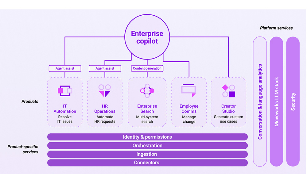
Moveworks, an AI-powered employee support, application uses only different shades of purple in its stack diagram.
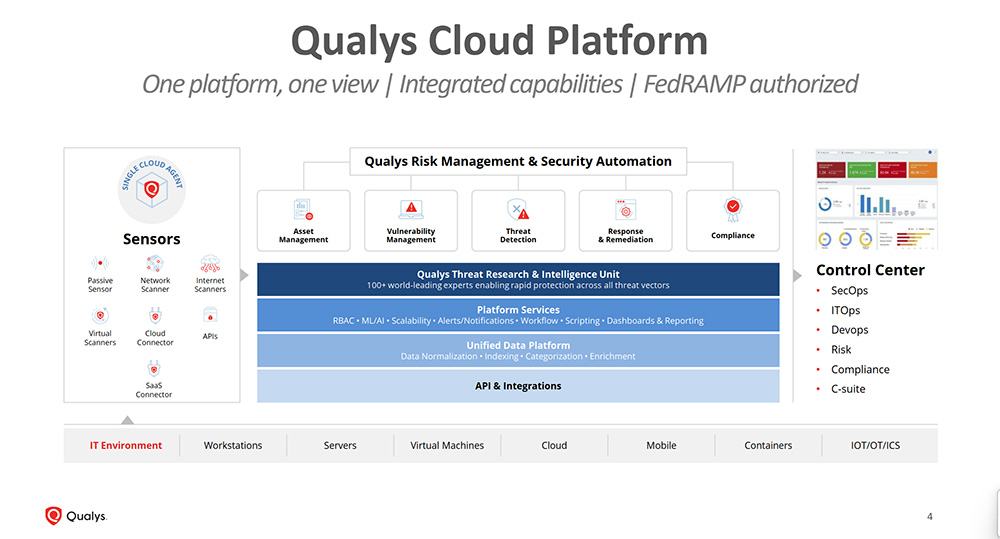
Qualys uses different colors and iconography to distinguish the various layers of its stack.
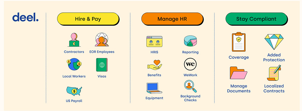
Deel uses colorful iconography to visually differentiate its 15 different offerings.
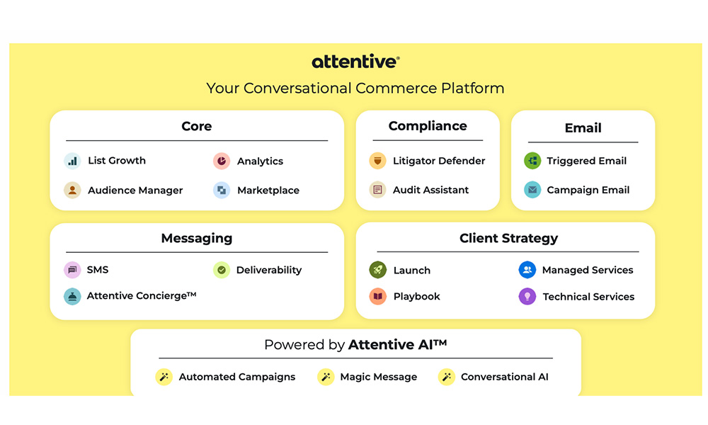
Attentive uses background colors on both the slide and iconography to make its marketecture diagram more visually appealing.
Design and Differentiation
Use of Text
Power Verbs and Value Statements
Marketecture diagrams should tell a story that is self-explanatory even in the absence of an accompanying narrative. If someone emailed a copy of your corporate overview presentation with a marketecture diagram in it, would the viewer be able to understand the value proposition you provide? Many tech companies supplement the groups of products and features on the diagram with additional text that explains “why it matters.”
One common approach is to use “power verbs” that communicate how the customer is empowered with new capabilities once on your platform.
Elastic uses power verbs such as “Visualize and Explore,” “Search and Analyze,” and “Ingest Everything” to explain the value proposition of its offerings.
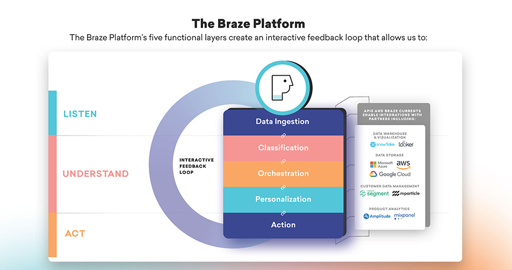
Braze uses power verbs such as “Listen,” “Understand,” and “Act” alongside its product capabilities to communicate the value of its products to the market.
Others will include a simple, one-sentence benefit statement that explains why the capabilities are impactful to the customer.
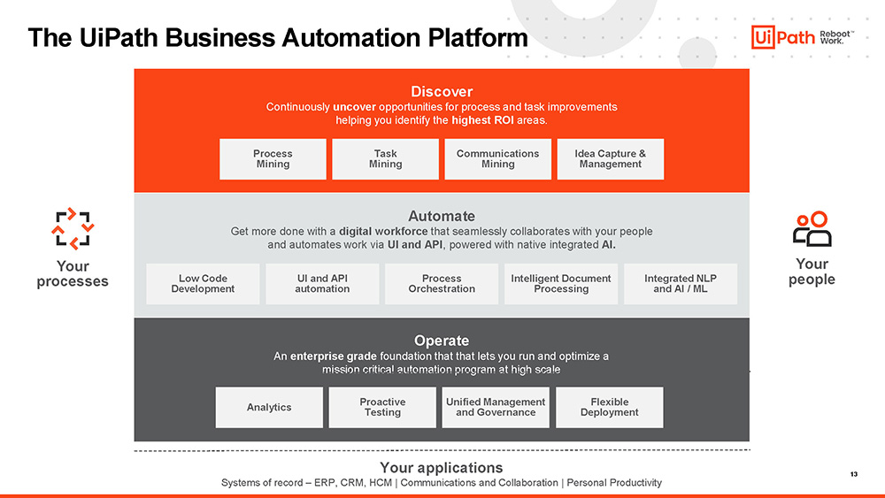
UiPath explains the value of each of the three layers of its stack – Discover, Automate, and Operate along with a single sentence to explain each.
When including power phrases and value statements it is important to be hyper-selective in each phrase that you include. These words take up critical real estate on the diagram so its important to balance the need to explain the value with the desire to keep the marketecture clean and easy to read.
Looking for more info – check out this article which shares 25 examples of marketecture diagrams.